
We'll call you back
Veronica Medina
Web Design
Website
Online Store
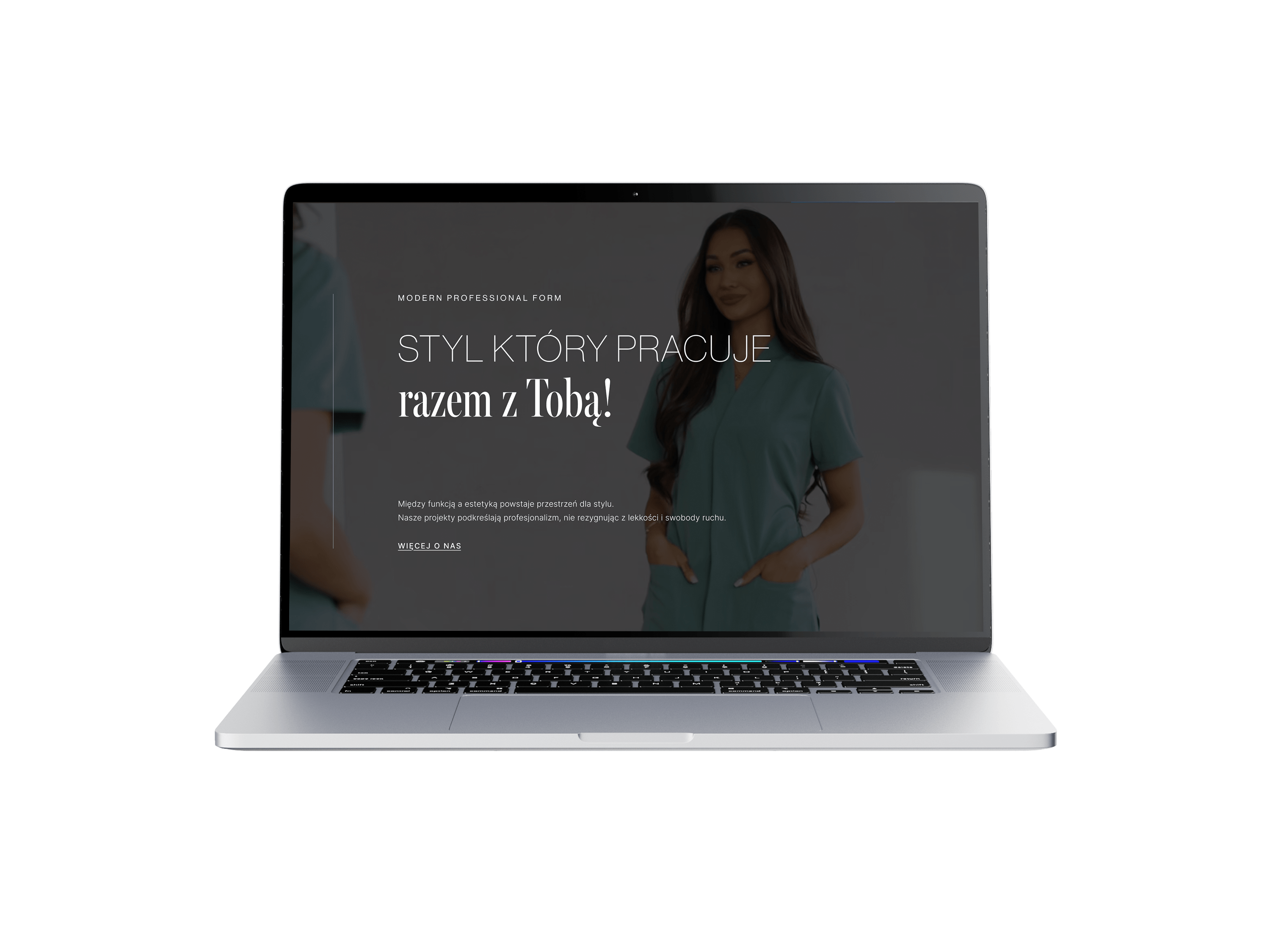
An online store project for a medical apparel brand proving that a uniform can be just as stylish as it is functional. The goal was to design an e-commerce site that not only organises the collections and makes choosing a product easier, but above all presents medical clothing as a conscious style choice – something you enjoy wearing to work.
No items found.
About the brand
Veronica Medina is a medical apparel brand creating uniforms for doctors, nurses, beauticians and other healthcare professionals. What sets the brand apart is the combination of functionality and aesthetics – the collections are designed for people who want to look good at work without giving up comfort and quality. In this project it was important to create a store that not only sells, but also conveys the character and level of the brand.
Our scope of work
What we do





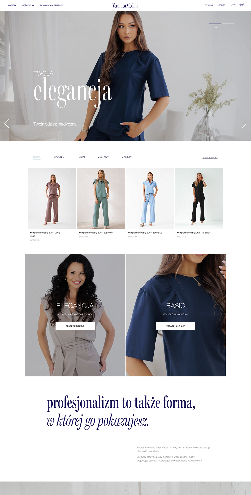
As part of the project we built the online store from scratch, designing it individually around the specifics of the offer and the brand's tone of voice. Veronica Medina has a broad product catalogue split into several collections – it was crucial to structure the store so that users can move easily between categories, filter products and reach the model or set they are interested in without effort.
We put a lot of emphasis on product presentation – on category and product pages we made sure the rich product photography is showcased in a way that supports sales and builds a premium perception of the brand. At the same time we took care of a clear purchase path and highlighted the collection endorsed by Medycyna na Obcasach as an extra sales argument and a differentiator against the competition.
Your customer isn't sitting at a desk
Mobile isn't a trend, it's where sales happen

.png)
1.
Medical wear you want to show off – not hide
On mobile, customers often browse between appointments, on a break, on the go. That is why the layout was designed so the product photography makes an impression on the first scroll and holds attention long enough to turn browsing into a purchase.
2.
Collections clear at a glance, cart within thumb's reach
A medical apparel store has to work smoothly on a phone – that is where most of the sales happen. Navigation between collections, filters and the route to the cart were designed so the user never has to think or search.
3.
Aesthetics that sell
This was not a project built on elaborate mechanics, but on showing the product deliberately. Mobile was laid out so that every collection looks like a lookbook, not a medical catalogue.
Scope of our work
Dedicated solution
The value in this project was not the technology itself, but the answer to a specific problem: how to sell medical apparel online in a way that does not reduce it to a uniform from a catalogue. The store was designed to combine easy navigation across collections, premium product presentation and a smooth purchase path – in an environment that speaks to the customer in the language of fashion, not just the medical industry.


If you are looking for an agency that is not passive in cooperation and can take responsibility for strategy, SEO and Google Ads campaigns for several brands at once, I can wholeheartedly recommend Igor and Sky.
Together, we made it happen
Brands that chose sky









TIME FOR THE NEXT STEP
CONTACT US
Do you have a store, service, or brand you want to genuinely grow online?
Head over to our simple contact form and let us know what you need today.
We will get back to you with a concrete proposal for next steps and a time for a brief call.