We will call you back
I was looking for a good team to run our website. I wanted someone who would know what to do to turn it into profit and enquiries from new clients. Igor and his team are exactly those specialists.


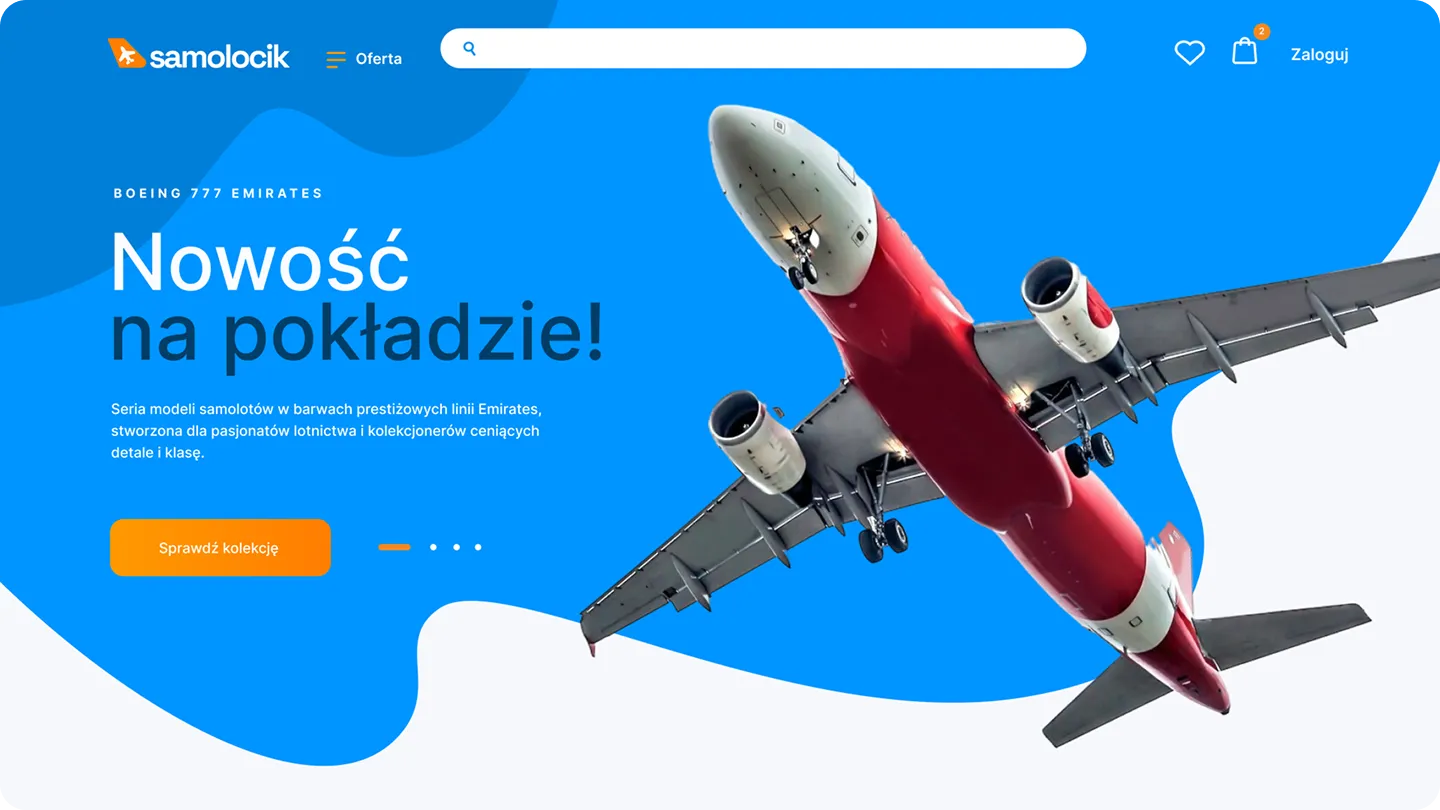
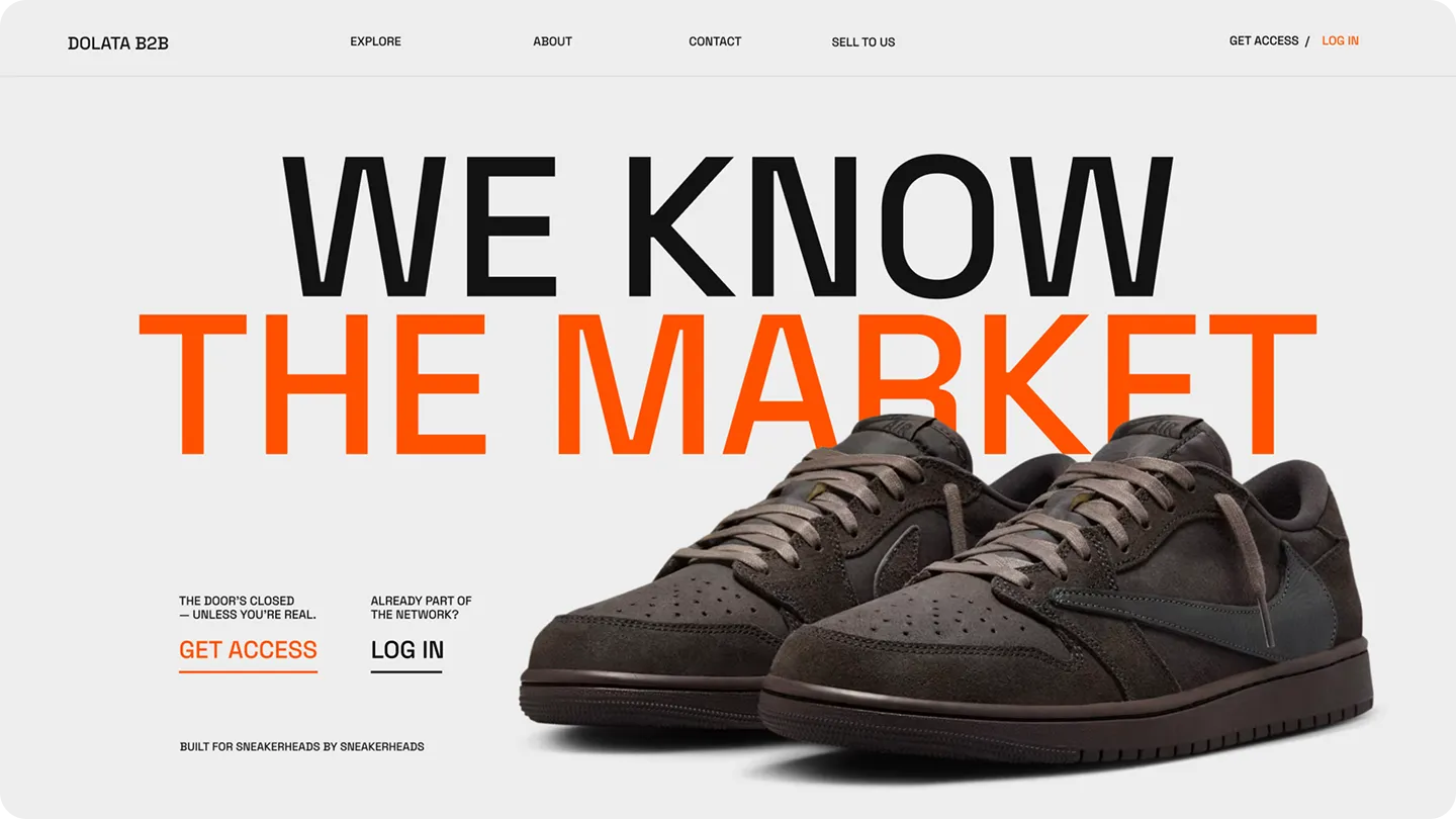
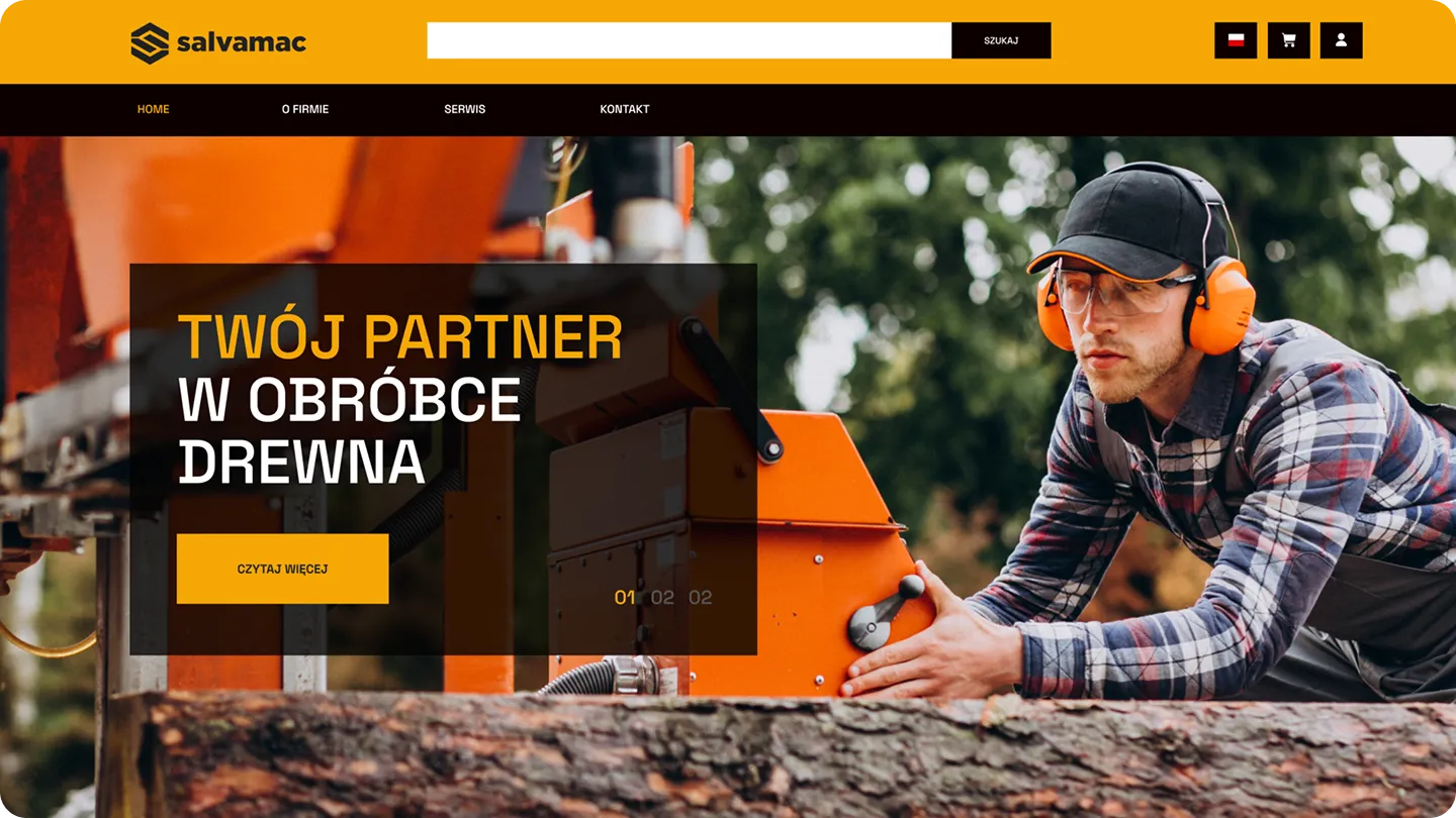
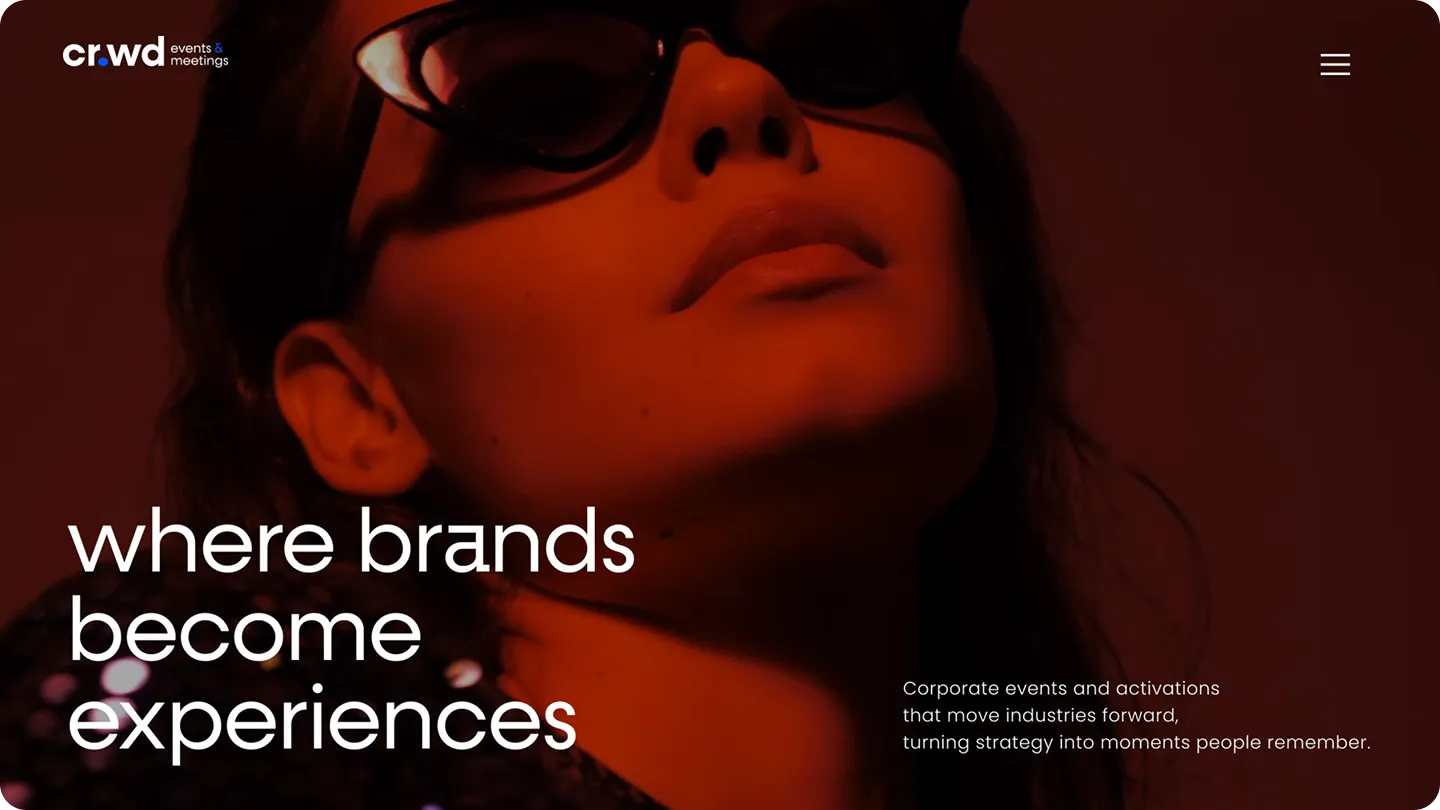
We design websites with their intended purpose in mind. Custom design, bespoke mobile views, and content structure tailored to your goals—whether that's sales, lead generation, or brand building. No pre-made templates.
The hero section, the offer, the form, and the trust sections. Each of these elements helps the user understand where they are, what they gain, and what step to take next. We design them so the site doesn't just look good, but clearly leads to a conversion.



In Meta, Instagram, or TikTok campaigns, most traffic comes from phones. If your mobile site doesn't deliver, your ad budget disappears faster than the user can make a decision.
Shopping and lead generation rarely happen at a computer these days. They happen in the evening, on the go, with a phone in hand. The phone is the moment of decision, not the computer screen.
Page layout, content, and CTAs must be designed for the user's phone and for sales. If a mobile site design doesn't guide the user to their goal, sales simply drop off.
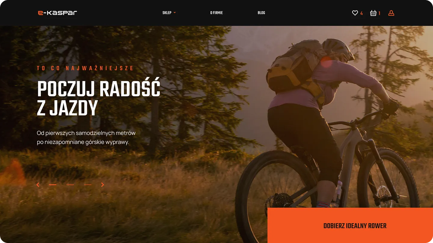
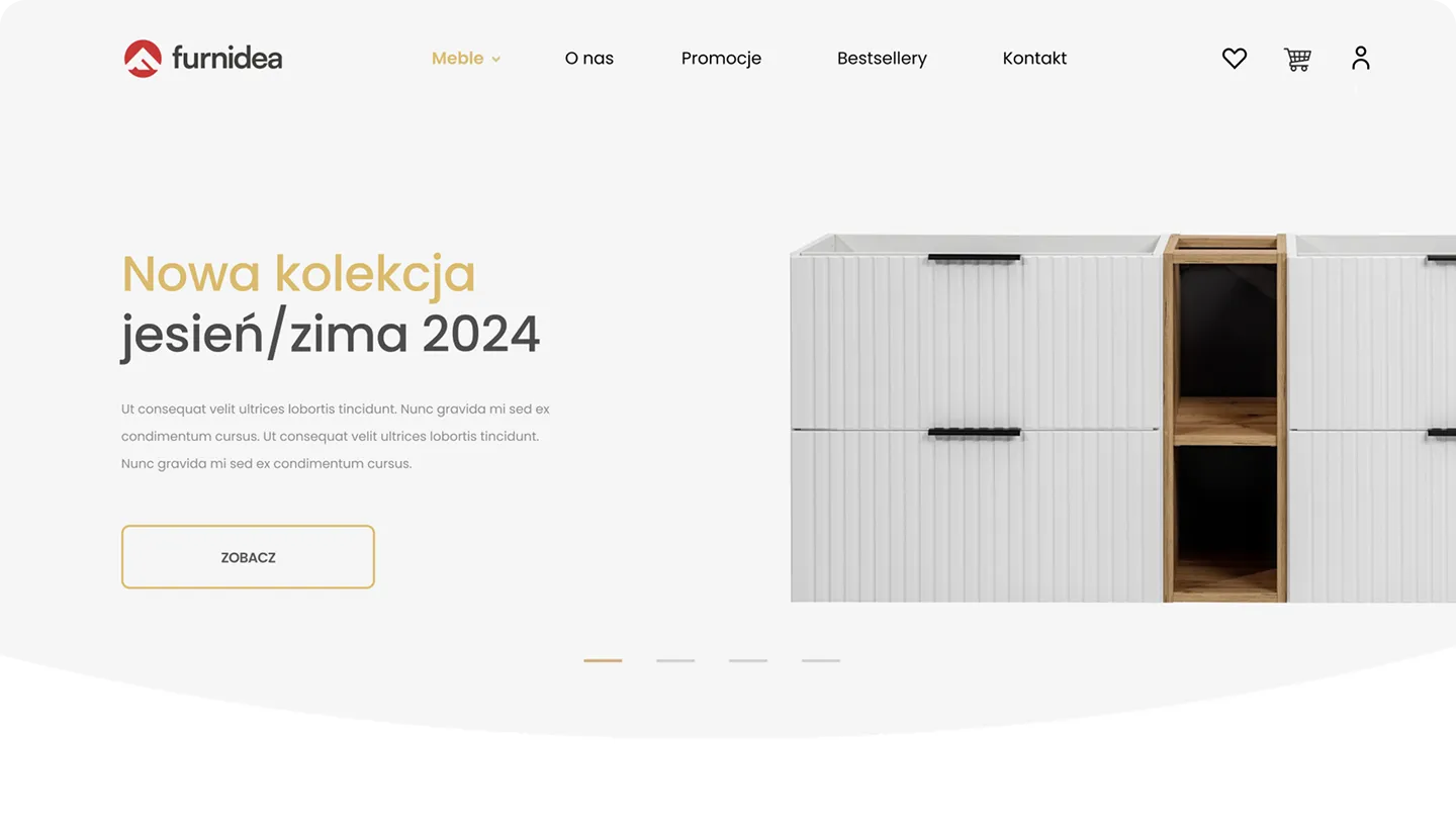
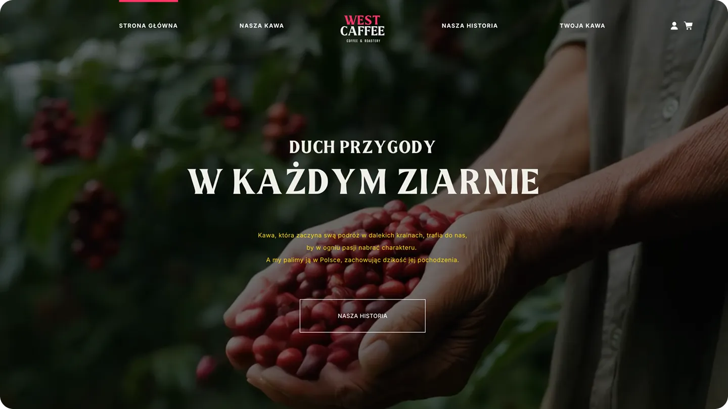
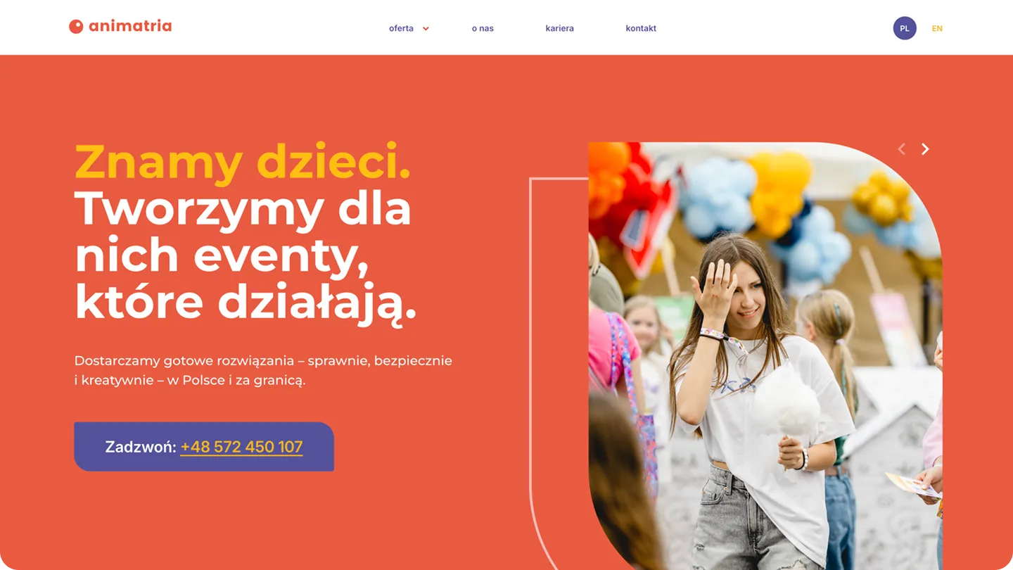
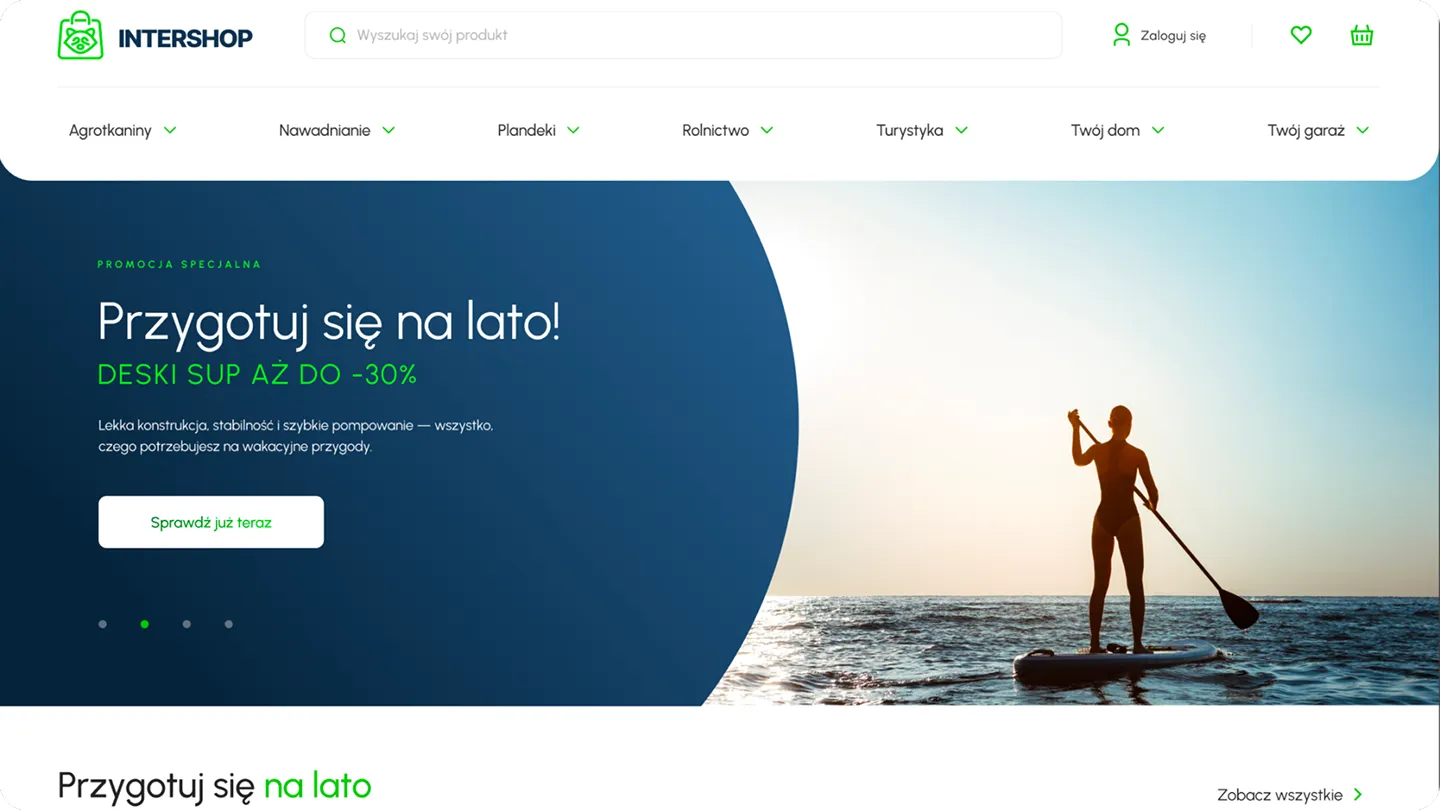
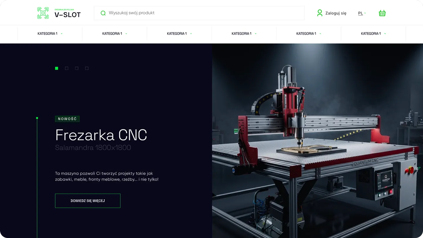
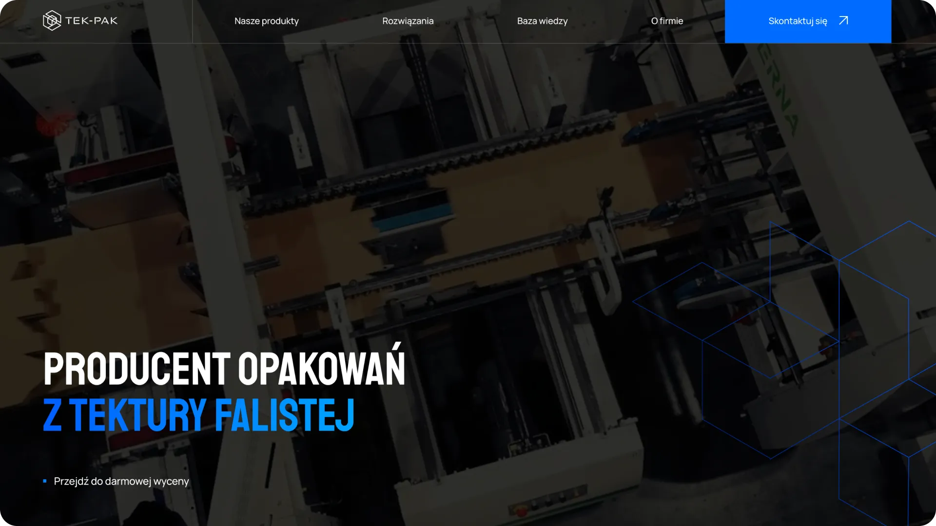
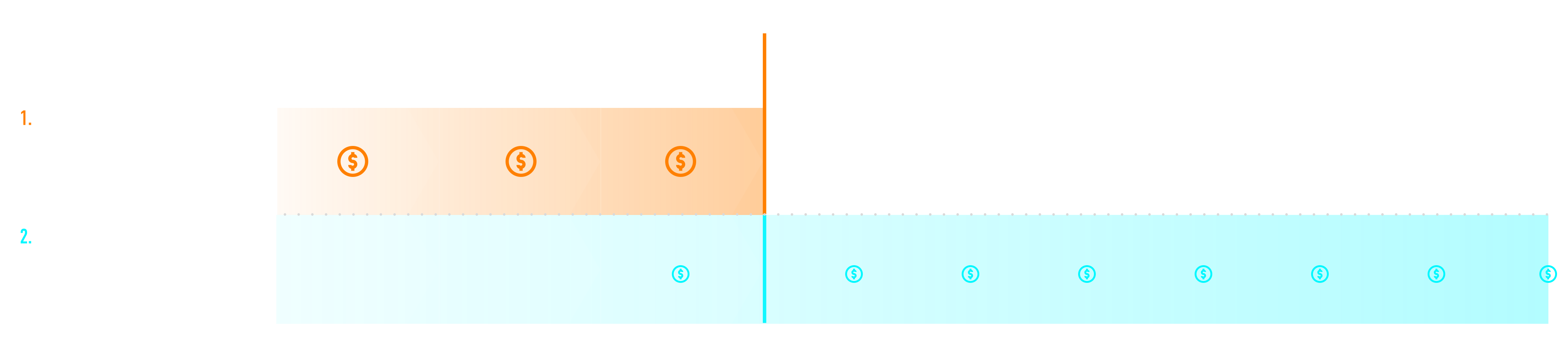
We divide every project into three stages. At the end of each stage, you will know exactly what has been completed, and only then will we settle the payment. If you prefer to spread the cost over time, we can set up an installment plan tailored to your business rhythm.
We never charge the full amount upfront. Not because we have to, but because we believe this is what a fair approach to a project should look like.
We talk about business first
The result: A clear direction before the first graphic design is created.
We design mobile-first
Result: Approved design ready for implementation.
We code, test, and deliver
Result: Website published, analytics active, and you have full control over the content.
Arek is responsible for ensuring that every site we deliver works exactly as it should. He oversees implementation, maintains code quality, and ensures that what we designed actually comes to life in the browser. If you have a question about your project, you have direct contact with him.
MEET THE SKY TEAMEvery month, you get a clear picture of your results along with an analysis of the situation
Regular online meetings to discuss results, priorities, and actions
You talk to the specialist who is actually managing your project
You have constant contact with the team via a shared messenger
Clear terms of cooperation. We retain clients with results, not contracts
We suggest directions, tests, and moves that make sense
Strategy, creative, performance, web, and analytics under one roof
We speak clearly, concretely, and without agency jargon


Since we started working with Igor and his team, the store we work on has genuinely grown and, above all, we understood that advertising can be done far better, smarter and more effectively. This is a partnership focused on growth and numbers, not empty promises.


Sky Agency is our third marketing company and we hope it will be the last. They run marketing for our two clothing brands and from the very beginning we felt they treat our cooperation in a truly individual way. Beyond marketing itself, they also help us grow the companies and look at everything much more broadly. What we value most is the communication. It is fast, to the point, and we constantly feel that someone is on top of things. There is never a problem getting an answer or discussing new ideas. You can tell this is built by people who genuinely put their heart and commitment into their work. Working like this simply feels calm and supported, and that matters a lot to us!

I have worked with Sky Agency for several years on various projects – a website, recruitment process automation, SEO. If I had to sum it up in one sentence: this is an agency where there is a real person behind the words, someone who takes responsibility. Igor as CEO does not disappear behind the team when things get difficult. That is rare and I value it. Together we built a tool for managing the recruitment of event staff – an application form, a candidate verification panel, automatic notifications, email integration. It sounds simple. At a scale of several hundred contractors a year and with the specifics of temporary work, it was a complex, non-standard brief. And I will say more: in difficult moments you see who you are really working with. And I do. I recommend them – especially to companies with non-obvious needs looking for someone who will dig deeper than a slide deck.
I recommend working with Sky Agency. Despite a very complex project requiring many custom solutions and integrations, everything was delivered professionally and in line with our expectations. The team stayed engaged throughout the whole process, and all key revisions were implemented until the final result was achieved.
.jpg)
We have been working with Sky Agency since 2022 – SEO, the rmcpolska.pl website and IT development support. More than four years of steady, well-organised cooperation. Igor and the team understood the specifics of our industry and are responsible for growing our online presence – from SEO to the new website we are designing together. IT tickets are handled quickly and without downtime. We value their straightforwardness, industry knowledge and partnership approach. We recommend them to any company looking for an agency that combines marketing with the technical side of business.









A website is often the first moment a customer truly meets a brand. Not in an ad, not in a post, not in a tagline, but in a place where they can check who you are, what you offer, how you think, whether you inspire trust, and whether it's worth taking the next step. That is why we design professional websites as full-fledged business tools, not digital formalities.
That is why web design should not start with choosing colors, tile layouts, or portfolio inspiration. It starts with a goal. The site is meant to sell, generate leads, build a brand, support recruitment, educate the market, drive contact, or organize an offer. Only when we know what is supposed to happen on the site can we meaningfully design the structure, content, design, and technology—this is the foundation upon which every good web design agency relies, regardless of project scale.
At Sky, as a web design agency, we build websites with the user's decision-making process in mind. Custom design, bespoke mobile views, thoughtful information architecture, and content structure tailored to the goal are more important than a flashy layout without function. We don't use ready-made templates just to "get something up" faster. As a website design agency, we focus on an individual approach to every project—the site should look good, but above all, it must perform.
Our new subpage captures this direction perfectly: we design sites with a clear purpose in mind—whether it's sales, lead generation, or brand building. This should be the starting point for designing and building websites for every company, regardless of the industry.
Many companies still treat their website as a digital business card. A logo, a few sentences about the company, an offer, contact info, and a background photo. The problem is that users don't visit a site to admire its existence. They visit because they need something—which is why professional website development treats the site as a tool to meet that need, not as a digital formality.
They want to check the service. Compare companies. Understand the process. See case studies. Ensure they can trust you. Know the price or at least the scope. See who is behind the brand. Send a form. Buy. Schedule a call. Find confirmation that they are in the right place.
A good website guides the user through these questions. It doesn't force them to hunt for basic information. It doesn't hide contact details. It doesn't speak in generalities. It doesn't start with self-praise, but with an understanding of the user's situation.
A company website is where a brand has the chance to turn attention into a decision. If that attention is wasted, the next click often leads straight to a competitor.
Every effective web development project begins before the design phase. You must first understand the business, the offer, the audience, and the context in which the user arrives at the site. Designing for a B2B brand with a long sales cycle is different from designing for a local service business, a startup, a premium brand, or a company looking to generate leads from ad campaigns.
We analyze who the site is speaking to, what actions it should trigger, what the competition looks like, and what can be done differently. This approach is embedded in the process shown on our new site: first, a conversation about the business, target audience, site goals, and competitive landscape, and only then, the design phase.
This ensures the site isn't just a collection of pretty sections, but a well-thought-out communication tool. It clarifies what belongs on the hero screen, what information should follow, where a user might have doubts, when to provide social proof, and where to invite them to get in touch.
Building websites without this stage might result in a visually striking mockup, but not necessarily a site that delivers results.
Before the final design is created, the site structure must be mapped out. Information architecture answers key questions: what sections are needed, in what order should they appear, what does the user need to understand first, where will the CTA be placed, how should subpages be linked, and how do we guide the visitor from entry to action?
This stage often determines a site's effectiveness more than aesthetics alone. Even a beautiful design can fail if the content is scattered, the offer is unclear, and the user doesn't know what to do next.
In practice, information architecture includes the sitemap, menu, heading hierarchy, section order, internal linking, offer structure, service categorization, content presentation, and form logic. The new subpage rightly emphasizes content hierarchy tailored to the user and designing the layout as a cohesive system.
Good architecture is invisible when it works. The user simply feels that the site is simple, logical, and guides them forward effortlessly.
Users quickly judge whether a site looks credible. They don't analyze the entire offer immediately. First, they get a general impression: does the brand look professional, is the message clear, does the site load quickly, does the design fit the industry, is the copy specific, and is it easy to move forward?
The first screen should answer a few simple questions: where am I, what does this company do, who is this for, why should I stay, and what is the next step? If the user has to guess, the site starts losing their attention.
This is especially important for traffic from ads, SEO, and social media. The user clicked because something caught their interest. The site must immediately confirm that the click was worth it. If the message on the site doesn't match the promise of the ad or search result, trust vanishes.
Professional websites don't need to shout. They need to quickly set the context and show that the brand knows who it is talking to.
A ready-made template might look good in a preview. The problem starts when you have to adapt it to a real offer, an unconventional content structure, your brand's unique style, and a specific user journey. Often, it turns out that the company has to adapt to the template, not the other way around.
Custom design provides greater control. We can design a site around goals rather than the limitations of a pre-built layout. We can establish our own information hierarchy, section rhythm, visual system, offer presentation, mobile views, and interactions that fit the brand.
The new site makes a bold declaration: no ready-made templates. This is important because a professional website should be recognizable, not look like just another version of a popular theme with swapped-out photos.
A custom design doesn't mean excess. It’s not about animations for the sake of animation or a design that tries to impress rather than help. It’s about a site that has its own character while not hindering the user’s decision-making process.
Website UX is the way a user navigates through content, sections, forms, buttons, and decisions. Good UX doesn't require instructions. The user knows where to click, what to read, how to go back, how to compare information, and how to contact the company.
The new subpage highlights the "UX that leads to conversion" section: the homepage, product page, cart, and forms are where a customer decides whether to stay or leave. For corporate websites, the hero section, service descriptions, social proof, CTAs, case studies, contact forms, and offer pages play a similar role.
When designing UX, we focus on information hierarchy, content readability, contrast, the size of clickable elements, form length, CTA placement, mobile behavior, and ensuring the user doesn't hit any dead ends.
A good website doesn't ask the user to put in effort. A good website guides them forward.
A website's UI is its visual layer: typography, colors, layout, buttons, graphics, icons, photos, animations, and details that shape brand perception. However, UI should never be disconnected from UX. A site might look great in a mockup while being difficult to use.
Good UI design reinforces the message. It helps highlight the most important information, builds the rhythm of the page, makes content easier to scan, and showcases the brand's character. A law firm's website should look different from a tech brand, a creative agency, or a local service business.
In web design, aesthetics matter because users judge credibility by appearance. But appearance cannot overshadow function. If an animation slows down the site, a visual effect hinders reading, or an unconventional layout hides the offer, the design starts working against the brand.
The best UI is memorable but not self-indulgent. It gives the brand style and the user clarity.
A website cannot be a large desktop project first and an "adapted mobile version" later. Users very often access a site from a phone: via ads, social media, Google results, messages, newsletters, or QR codes. The phone is the primary screen for decision-making.
The new page strongly emphasizes mobile-first: clients scroll, decisions are made on the go, and the site layout, content, and CTAs must be designed for phones. This is one of the most important points in web design.
In practice, this means thinking about mobile views separately. Text must be legible. Buttons must be easy to tap. Forms should be short and convenient. Sections must be arranged in the right order. Images should be lightweight. Menus should be simple. CTAs must be visible. Animations must not get in the way. The site must guide the user to their goal on a small screen, not just "display somehow."
If the mobile site doesn't work, marketing fails. Campaigns can drive traffic, SEO can earn clicks, and social media can spark interest, but the decision happens on the website. Most often, right on the phone.
A responsive website adapts to different devices. Today, that is the minimum, not a competitive advantage. Responsiveness alone means the site technically displays on a phone, tablet, and desktop. But a good mobile version requires more: a separate information hierarchy, a refined layout, and a conscious effort to shorten the user journey.
Sometimes an element that works great on desktop becomes too long, too heavy, or illegible on a phone. Sometimes a three-column section requires a complete rethink. Sometimes a form should have fewer fields. Sometimes a CTA needs to appear earlier.
That is why we design from mobile up. On the new page, this stage is described directly: dedicated views for every device, content hierarchy tailored to the user, and graphics, typography, and layout as a single system.
A responsive website simply works on different screens. A mobile-first website sells and generates leads on the screen the user is actually using.
A website should be designed with SEO in mind from the very beginning. Not after implementation, not after publication, and not when you need to rescue your visibility. SEO influences page structure, headers, URLs, content, speed, internal linking, and the technical foundations of the site.
SEO-focused web development includes keyword analysis, information architecture, header structure, meta titles, meta descriptions, indexing, sitemaps, structured data, page speed, image optimization, clean URLs, and logical internal linking.
A good website doesn't need to be overloaded with text to support SEO. It must contain content that answers user intent and gives search engines a clear signal of what each page is about. The homepage, service pages, blog, case studies, and FAQ sections should form a cohesive structure, not isolated islands.
Previous content correctly highlighted the role of SEO specialists in the optimization process. This is worth maintaining, as sites designed without SEO often require fixes immediately after launch. It is better to build them right from the start.
Your website must be ready for campaign traffic. Google Ads, Meta Ads, TikTok Ads, LinkedIn Ads, newsletters, remarketing, and social media can drive users to various landing pages, but each one must deliver on the promise of the source.
If an ad highlights a specific service, the landing page should clearly elaborate on it. If a campaign promises a consultation, the form should be easy to find. If a user arrives via mobile, the landing page cannot load slowly. If a campaign targets cold traffic, the site must build trust faster than it would for a user who already knows the brand.
Designing websites for campaigns means thinking about conversion, analytics, and message consistency. CTAs, forms, trust signals, case studies, testimonials, competitive advantages, FAQs, and content structure must all support the user's decision-making process.
Your new site strongly emphasizes a comprehensive approach: strategy, creative, performance, web, and analytics under one roof. This is significant for websites because a site does not exist in a vacuum; it is the destination for all your marketing efforts.
Not every site should be built on the same CMS. The choice of technology depends on the goal, budget, team, growth plans, content editing needs, integrations, SEO, security, and who will manage the site after launch.
Your site indicates that you build using various technologies and that implementation includes configuring analytics, forms, and integrations. This is excellent communication, as technology shouldn't be chosen out of habit—it should support the business.
WordPress is a great fit for sites that need a flexible CMS, a blog, extensive content, SEO, and easy editing. It is a popular technology choice for building websites for many service companies, B2B brands, content portals, and corporate sites.
Webflow can be a great solution for brands that prioritize strong design, fast deployment, high control over the visual layer, and convenient content editing without a heavy backend.
Custom solutions make sense when a site requires non-standard features, specific integrations, greater control over the code, or a highly individualized process.
For projects with a sales component, e-commerce technologies can be considered, but for standard corporate websites, one thing is most important: the system should be user-friendly for the team and ready for growth.
A website shouldn't be a closed project where every minor change requires contacting a developer. A good CMS gives the client control over their content: the ability to edit text, add posts, update case studies, change photos, expand sections, and manage content marketing efforts.
During the implementation phase of a new subpage, the goal is clear: the site is published, analytics are running, and the client has full control over the content. This is a crucial element, as a site should remain dynamic after launch.
A CMS must be tailored to the people who will use it. A marketing team publishing regular content needs different tools than a small business owner who updates a few details once a month, or a large organization with many subpages, language versions, and a complex structure.
A well-implemented CMS provides freedom, not chaos. It allows you to edit content without breaking the design.
A site might look great, but if it loads slowly, the user may not stick around long enough to see it. Speed impacts UX, SEO, advertising campaigns, and conversion rates—especially on mobile, where connections can be weaker and user patience shorter.
Technical optimization includes, among other things, lightweight graphics, proper font loading, minimizing unnecessary scripts, layout stability, code quality, responsiveness, security, correct HTML structure, a sitemap, and the fundamentals of Core Web Vitals.
Technology and design must work in tandem. If a visual design is heavy, cluttered with unnecessary effects, and poorly implemented animations, the site will lose speed. If the code is unrefined, even a great design won't run smoothly.
Great web development is all about balance: a site should look modern without sacrificing usability or performance.
If a site is meant to generate leads, the form and CTA are among the most important elements of the design. These are not just add-ons at the bottom of a page. They are decision points.
A CTA should clearly state what the user can do: schedule a call, send an inquiry, download an offer, request a quote, book an appointment, check the portfolio, or go to the contact page. The form should only collect information that is truly necessary at the first stage. A form that is too long can be off-putting. One that is too general can result in poor-quality leads.
A well-designed lead generation site guides the user to contact through many paths. CTAs appear in the right places, the form is simple, contact details are visible, and the content addresses doubts beforehand.
Lead generation starts with trust. The form is just the final step.
Website design should not separate design from content. Text is not filler for a finished layout. It is one of the most important elements of the user experience.
Good website copy states clearly: what the company does, who it helps, what problem it solves, why it is worth trusting, and what to do next. It doesn't have to be overly long. It must be specific, well-structured, and tailored to the decision-making stage.
Website content should work in a rhythm. The first screen sets the context. Subsequent sections expand on the value. The next ones show proof: projects, testimonials, the process, the team, numbers, and examples. The CTA appears exactly where the user is ready for the next step.
An old text once stated strongly that a website should speak the brand's language and evoke emotions. That is still true, but it is worth adding: emotion must go hand in hand with clarity. A site that sounds nice but doesn't explain the offer is missing its chance.
Service subpages are particularly important for corporate websites. They are often what generate traffic from SEO, handle users from ads, and address specific purchase intentions.
A good service subpage should clearly show what the offer is about, who it is for, what problem it solves, what the process looks like, what the collaboration includes, what the results are, what the proof of experience is, and how to start a conversation. It shouldn't be a brief note about a service. It should act as a standalone sales argument.
When designing a website, it is worth planning the structure of service subpages from the start. This allows the site to grow in SEO, better support campaigns, and more precisely address user needs.
A single "services" page with everything on it is often not enough. A user looking for a specific service wants to find a specific answer.
The homepage has a difficult task. It must quickly introduce the brand, organize the offer, direct the user to the most important areas, and leave a good first impression. However, it shouldn't try to say everything.
A good homepage acts like a map. It shows who the company is, who they work for, what they offer, why they are trustworthy, and where to go next. Users should be able to quickly find their path: to a service, portfolio, contact page, case study, product, blog, or form.
Hierarchy is key in homepage design. Context first. Then value. Next, the offer. Followed by social proof. Finally, details and a CTA. Of course, the layout depends on the brand, but there is one rule: the user should never feel like they have landed in a chaotic directory of sections.
The homepage should open doors, not replace the entire website.
Users rarely believe claims alone; they want to see proof. That is why portfolios, case studies, client testimonials, brand logos, metrics, certifications, team photos, work processes, and real-world examples are so important in web design.
The new subpage features a portfolio, client perspectives, and the brands that have chosen Sky. This is a great direction, as a service-oriented website must build trust not only through text but also through evidence.
A case study is particularly powerful because it shows not just the final result, but also the thought process. What was the problem? What decisions were made? What was implemented? What was the outcome? This type of content helps the user visualize what working with you is like.
Trust signals should be placed near decision points. If a user is reading about a service, show them a project example. If they are moving toward contact, remind them of a testimonial. Trust is built at the exact moments where hesitation arises.
Not every company needs a website built from scratch. Sometimes they need a redesign: a visual refresh, a structural overhaul, improved UX, better mobile performance, stronger content, a new CMS, or optimization for SEO and campaigns.
A website redesign should begin with a diagnosis. What works on the current site? What generates traffic? Which pages are visible on Google? Where do users drop off? Which elements are worth keeping? What needs to be rebuilt? Without such an analysis, it is easy to create a prettier site that loses some of its existing potential.
You must be careful with SEO during a redesign. Changing URLs, removing content, failing to set up redirects, or restructuring without a plan can lead to a drop in visibility. That is why a redesign should integrate web design, SEO, and analytics.
A new website should be better not just visually, but also in terms of performance.
Sometimes a full corporate website is too much, and a standard subpage is not enough. That’s when you need a landing page: a focused page designed for a specific campaign, service, product, event, or offer.
A good landing page has a clear goal. It doesn't distract the user with too many options. It presents a promise, expands on benefits, addresses objections, builds trust, and leads to a single action—whether that’s filling out a form, making a purchase, signing up, downloading a resource, booking a consultation, or making a reservation.
When designing a landing page, we focus on consistency with ads, loading speed, mobile responsiveness, CTAs, forms, trust signals, analytics, and testing capabilities. A landing page shouldn't just be a pretty poster; it should be a campaign tool.
A website without analytics is difficult to improve. You might feel like it’s working, but you won't know where users are coming from, which pages they view, where they click, which forms they fill out, and which marketing channels are driving valuable traffic.
That is why analytics configuration should be part of the implementation. Google Analytics 4, Google Tag Manager, conversion events, forms, click-to-call buttons, inquiry submissions, file downloads, and other user actions must be tracked from day one.
The new subpage implementation phase includes the configuration of analytics, forms, and integrations. This is crucial because a website should not be a "black box" after launch. It should provide data that helps it grow.
Analytics is not just an add-on for large corporations. It is the foundation of informed marketing.
A modern website often needs to connect with other tools: CRMs, email marketing systems, booking calendars, payment gateways, automation platforms, analytics tools, live chat, webinar systems, or e-commerce platforms.
Integrations should simplify work, not complicate the site. A form can feed directly into a CRM. A lead can trigger an automated notification. A booking can block a slot in your calendar. A newsletter can add a user to the appropriate segment. Form data can help qualify inquiries.
These elements must be anticipated during the design phase. Otherwise, you may find that while the site looks good after launch, it doesn't fit the daily workflows of your sales or marketing teams.
A website should support company processes, not just present an offer.
We start the process by talking about your business. We want to know who the site is speaking to, what actions it should trigger, what is most important in your offer, what the competition looks like, and what your brand wants to do differently.
Then, we organize the structure. We create the information architecture, sitemap, section layout, and content strategy. This is the moment the site gains logic before the visual layer is applied.
Next, we move on to design and content. We design mobile-first, prepare dedicated views, and focus on information hierarchy, typography, graphics, page rhythm, and brand consistency. On the new subpage, this stage is described as mobile-first design, device-specific views, and a unified system of layout, typography, and graphics.
The next stage is implementation. We code the site, configure the CMS, forms, analytics, and necessary integrations. We test performance across various devices, verify speed, check form functionality, and validate key user journeys.
Finally, we launch the site and hand it over to the client with full control over the content. The site’s journey doesn't end on launch day. From that moment on, it begins gathering data, supporting marketing efforts, and highlighting which elements are worth developing further.
A website is an investment, so the collaboration model should be transparent. The client should know what they are paying for, what is being created at each stage, and when billing occurs.
The new subpage makes a very specific promise: the project is divided into three stages, billing occurs after each stage is completed, and costs can be spread out to align with business cycles. There is also a clear declaration that you do not require full payment upfront.
This is a strong communication point, as many companies fear not only the cost of web design but also losing control over the process. A phased model provides a greater sense of security. The client sees progress, signs off on individual parts, and knows exactly what has been completed.
Honest collaboration begins with clear rules.
A website should not be an anonymous project passed between teams. The client needs to know who is responsible for the implementation, code quality, site performance, and technical decisions.
A strong personal element is introduced on the new subpage: Senior Web Developer Arkadiusz Sawa is responsible for ensuring the site functions as intended, overseeing the implementation, and ensuring the project comes to life in the browser. This is worth keeping, as it builds service credibility.
Accountability is paramount in web projects. A design might look great in a design file, but only the implementation reveals whether the site is fast, stable, user-friendly, and intuitive. Effective communication between design, development, SEO, and analytics teams determines the quality of the final result.
Launching a website shouldn't be a moment of nervous checking to see if everything works. Before going live, a site must pass tests: on desktop, mobile, different browsers, and across the most important user scenarios.
We check forms, buttons, links, menus, the mobile version, speed, analytics accuracy, integrations, redirects, post-submission messages, CTA visibility, and basic SEO elements. If the site has multiple language versions, we also test language switching, hreflangs, and content consistency.
On a new subpage, testing on devices before publishing is part of the implementation and launch process. This is important because a professional website must be ready not just to be seen, but to be used.
An error in a contact form can cost you leads. A broken CTA can block conversions. A lack of measurement can hide a problem. Testing is not just a formality. It is the last line of defense against losing results.
After publication, a site comes to life. Data appears, along with user questions, editing needs, new sections, campaigns, updates, SEO content, and ideas for growth. A good site should be prepared for change.
Post-launch support can include developing subpages, UX improvements, new landing pages, SEO optimization, analytics, integrations, CMS updates, conversion testing, advertising campaign support, and content expansion.
A website is not a finished file. It is a tool that should mature along with the company. The best web projects don't end after publication. Over time, they get better because decisions are based on data and real user behavior.
A service company website should primarily build trust and lead to contact. Users usually don't make decisions immediately. First, they check whether the company understands their problem, has the necessary experience, what the process looks like, what the results of cooperation are, and whether it is worth leaving their contact details.
A good service website should have a clear offer, service subpages, a process description, trust signals, case studies, testimonials, FAQs, visible CTAs, and a simple form. SEO is also important, as users often land on service subpages directly from Google.
In services, text is especially important. It is not enough to write that a company is professional and effective. You need to show how it helps, how it works, who it is for, and why its approach makes sense.
In B2B, a website often doesn't sell immediately. It works beforehand: building credibility, explaining the offer, supporting sales teams, assisting with research, answering decision-makers' questions, and providing materials that can be shared within an organization.
A B2B site should be specific. It must clearly state which companies the offer is for, what problems it solves, what the process looks like, what the results are, who has already benefited, and what happens after making contact. Case studies, industry-specific sections, expert materials, comparisons, FAQs, and lead qualification forms work well.
In B2B, content architecture is also crucial. A user might visit the site as a specialist, manager, founder, or someone from the procurement department. Each of these people may be looking for slightly different information. A good site helps them find the right path.
A personal brand website has a different dynamic than a classic corporate site. Personality, experience, history, specialization, and trust in the individual are what matter here. The design should support recognition without overshadowing the person behind the brand.
A good personal brand website shows what the person does, who they work with, their experience, where their expertise can be seen, what their offer looks like, and how to get in touch. It may include a blog, podcast, speaking engagements, media features, testimonials, digital products, consultations, or a sign-up form.
In a project like this, the tone of communication is particularly important. The site should sound natural, not like an anonymous brochure.
A website is one of the most powerful brand assets. It is where tone of voice, design, content, user experience, and trust signals all come together in one place. When these elements are consistent, a brand becomes more memorable.
A good website does more than just inform. It sets the tone. It shows whether a brand is bold, calm, expert, premium, accessible, tech-focused, creative, local, ambitious, or highly specialized. Design and language must work together. If a brand talks about quality, the website cannot look haphazard. If it talks about simplicity, the website cannot be cluttered. If it talks about innovation, it cannot look like a design from a decade ago.
The previous content strongly emphasized that a website should convey brand values and build relationships. That is still a very good direction. It is just worth grounding it more firmly in specifics: structure, UX, content, social proof, and a consistent visual system.
The scope of the project depends on the type of website, its purpose, the number of subpages, the technology used, and business needs. A simple corporate site, a complex service portal, a landing page, and a B2B site with multiple sections, a blog, and integrations all require different approaches.
As part of our website design and development process, we can handle, among other things:
This approach allows us to build a website that is more than just a graphic design project. It is a ready-to-use tool for communication, marketing, and sales.
First, we talk about your business. We determine what the site needs to do, who will use it, what the goals are, and what actions the user should take. This is the direction-setting phase; without it, a project easily becomes just an aesthetic exercise.
After that, we organize the structure. We create the information architecture, sitemap, and section layouts. We decide how the user should navigate the content and where the most important messages should appear.
Then, we move to design. We prepare mobile and desktop views, focusing on UX, UI, typography, graphics, page rhythm, and brand consistency. The design should be unique, but never at the expense of functionality.
Next, we implement the site. We handle the coding, CMS configuration, forms, analytics, and integrations. We prioritize technical quality, speed, SEO, and responsiveness.
Finally, we test and launch. We check the site across devices, verify forms, events, links, mobile responsiveness, and core user journeys. Once live, the site is ready to work, and you have full control over the content. This process aligns with the layout shown on our new site: the path to success, design and content, implementation, and launch.
A new website makes sense when your current one can no longer keep up with your business. It might be visually outdated, not mobile-friendly, difficult to edit, poorly optimized for SEO, confusing for users, or misaligned with your current offerings.
Sometimes a company grows faster than its website. You have new services, a different sales model, a stronger portfolio, a larger team, better case studies, and a more mature brand, but the site is still telling a story from years ago. In that case, a redesign isn't just cosmetic. It’s an update to how your company presents itself to the market.
A new website can improve more than just your look—it can boost conversions, visibility, usability, campaign effectiveness, and user trust. The condition: it must be designed strategically, not just to look "prettier."
A good web design agency shouldn't think only about graphic design. A website impacts SEO, advertising campaigns, social media, sales, recruitment, customer service, and brand image. That is why you need to look at the bigger picture.
A key argument emerges on this new page: strategy, creative, performance, web, and analytics all under one roof. In web design, this is a major advantage because the website is the common denominator for all marketing activities.
A designer must understand the user. A developer must deliver technical quality. An SEO specialist must ensure structure and visibility. An analyst must measure conversions. A copywriter must articulate the brand's value. Only then do you get a site that isn't just a pretty view, but one that functions as a part of your business.
Whether you need a new corporate website, a redesign of your current site, a campaign landing page, an extensive service portal, a B2B site, a personal brand site, or professional websites that finally showcase your company's quality at the level it deserves.
As a website development agency, we will prepare your website project based on goals, structure, UX, UI, mobile-first, SEO, technology, analytics, and implementation. We ensure a dedicated design, a user-friendly CMS, forms, integrations, speed, pre-launch testing, and full control over your content after go-live.
A good website isn't just a place that exists online. It is a tool that tells a brand's story, guides the user, and helps them make a decision. To be effective, it must be designed with people, technology, and results in mind simultaneously.
Do you have a store, service, or brand you want to genuinely grow online?
Head over to our simple contact form and let us know what you need today.
We will get back to you with a concrete proposal for next steps and a time for a brief call.