We will call you back
I was looking for a good team to run our website. I wanted someone who would know what to do to turn it into profit and enquiries from new clients. Igor and his team are exactly those specialists.


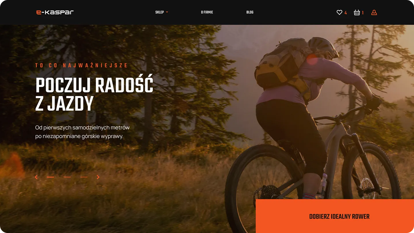
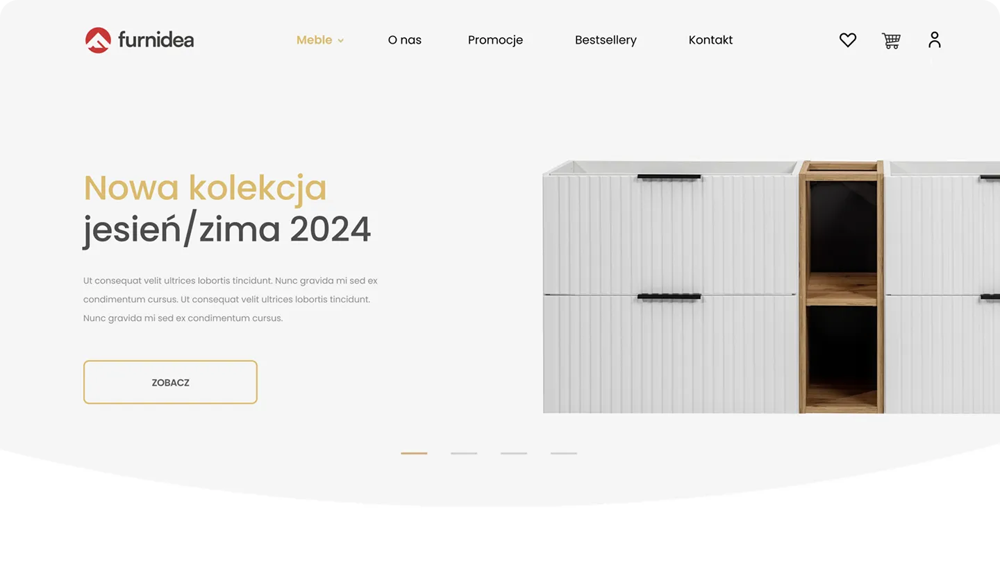
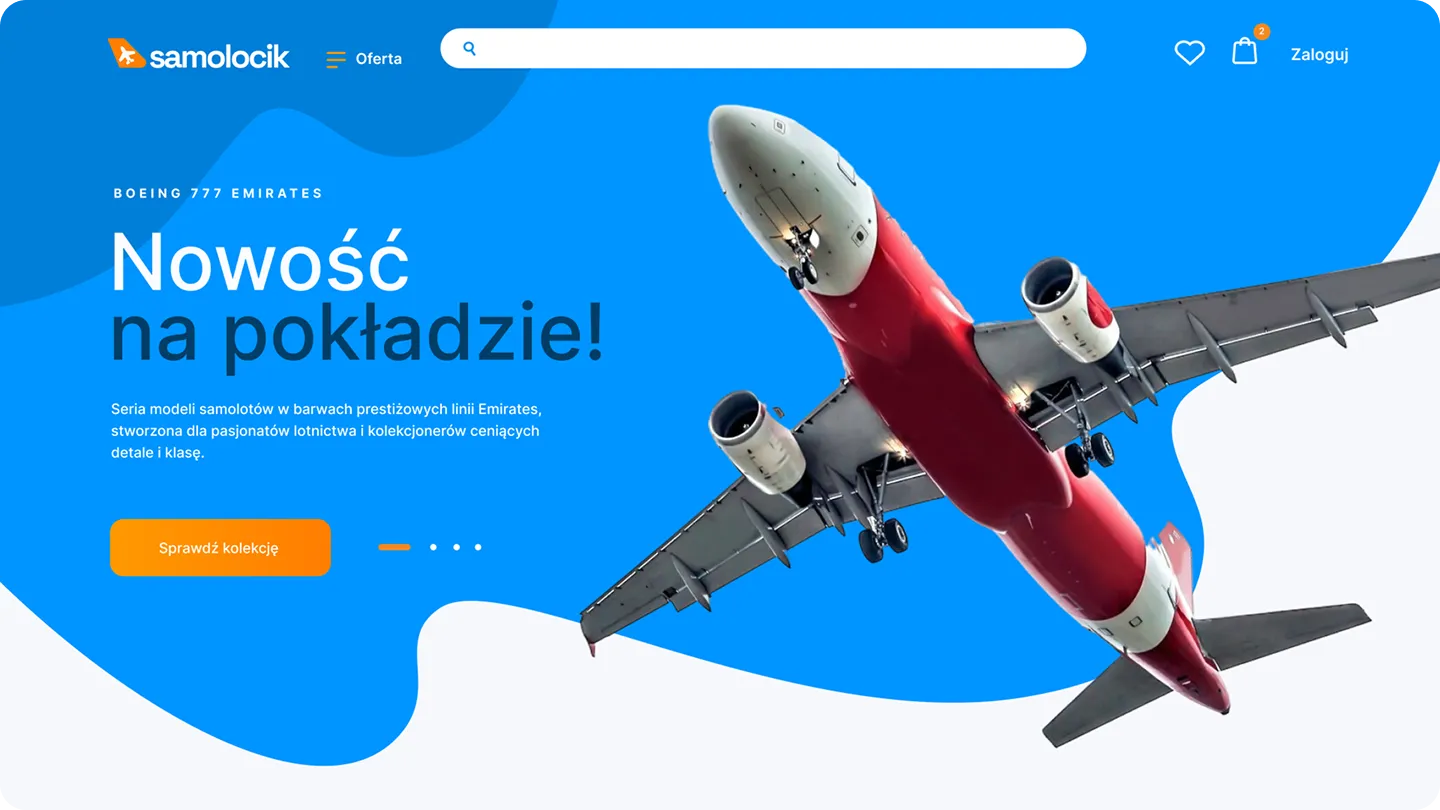
We design and build online stores that sell. Dedicated mobile-first design, thoughtful product architecture, and full integration of payments and logistics. No pre-made templates, no compromises on UX. Your store is built to generate revenue from day one.
The hero section, the offer, the form, and the trust sections. Each of these elements helps the user understand where they are, what they gain, and what step to take next. We design them so the site doesn't just look good, but clearly leads to a conversion.



In campaigns on Meta, Instagram, or TikTok, the majority of traffic comes from phones. If your mobile site doesn't deliver, your ad budget disappears faster than the user can make a decision.
Shopping and leaving contact details rarely happen at a computer these days. They happen in the evening, on the go, with a phone in hand. The phone is the moment of decision, not the computer screen.
Page layout, content, and CTAs must be designed for the user's phone and for sales. If a mobile site design doesn't guide the user to their goal, sales simply drop off.

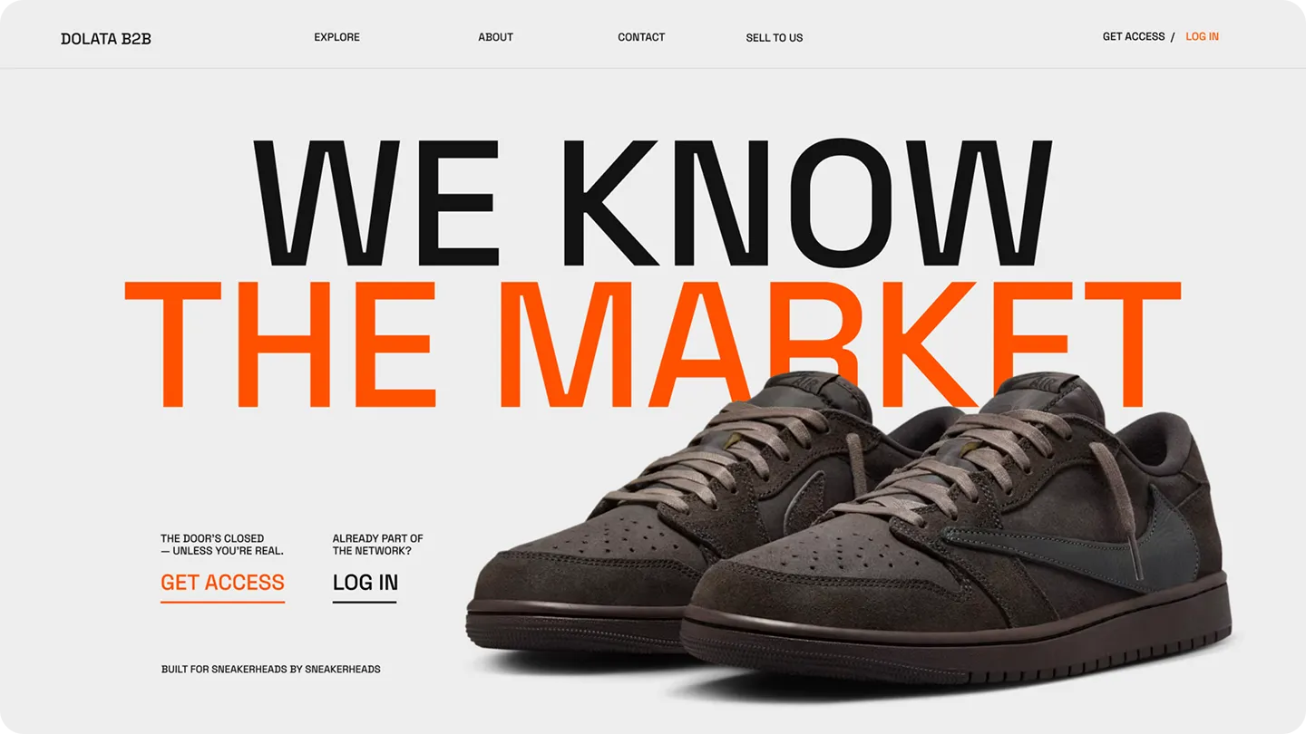
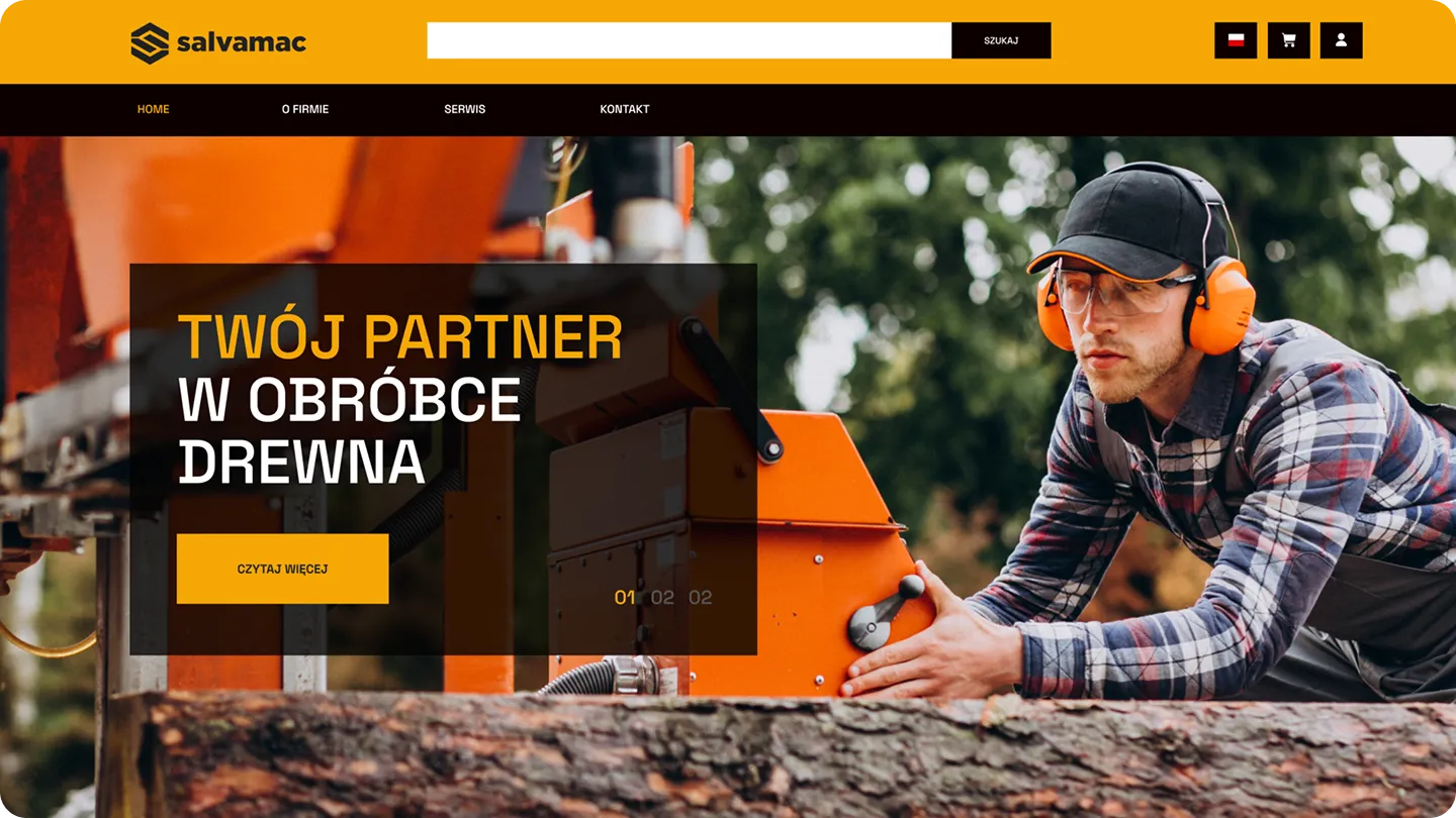

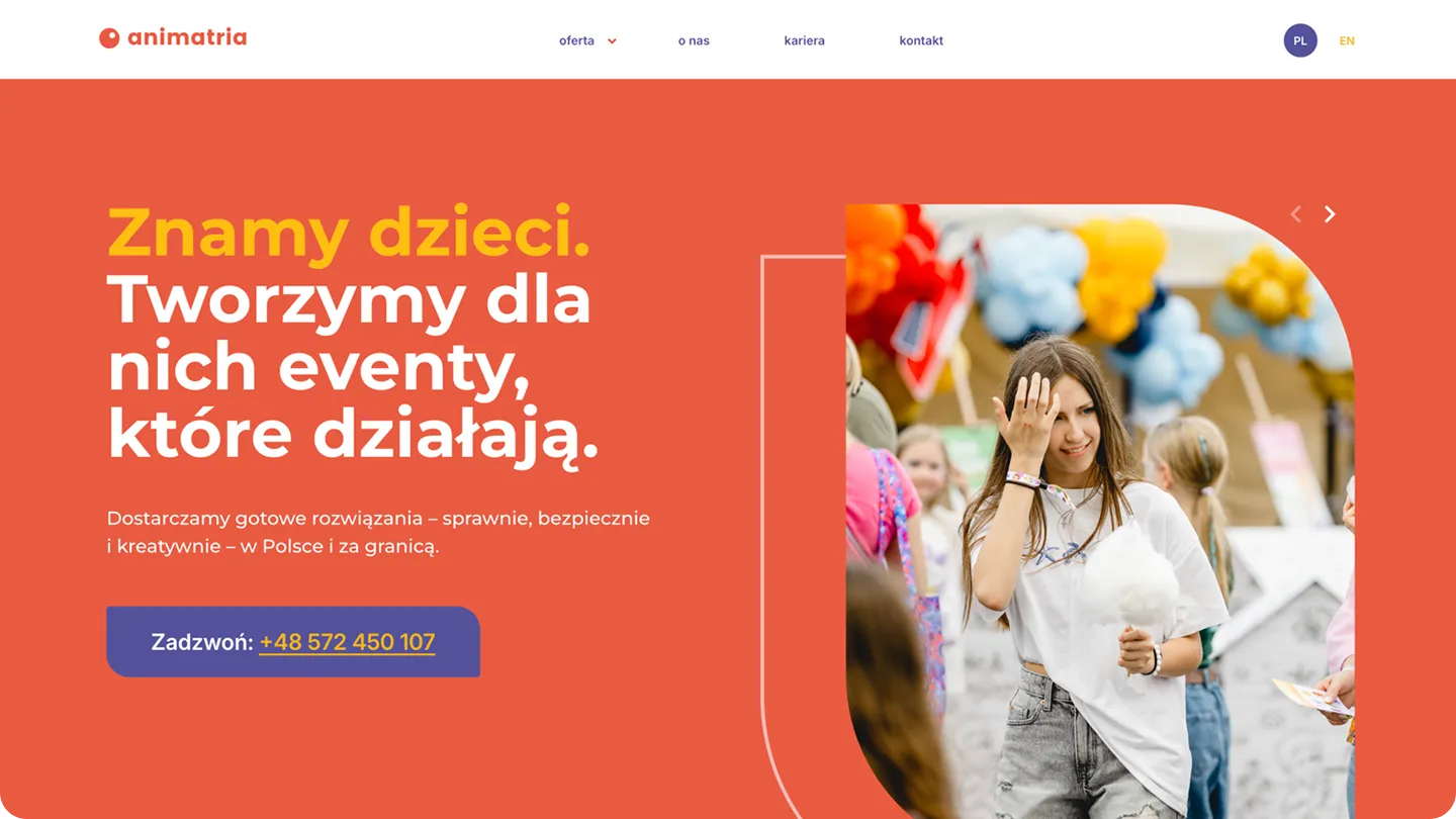
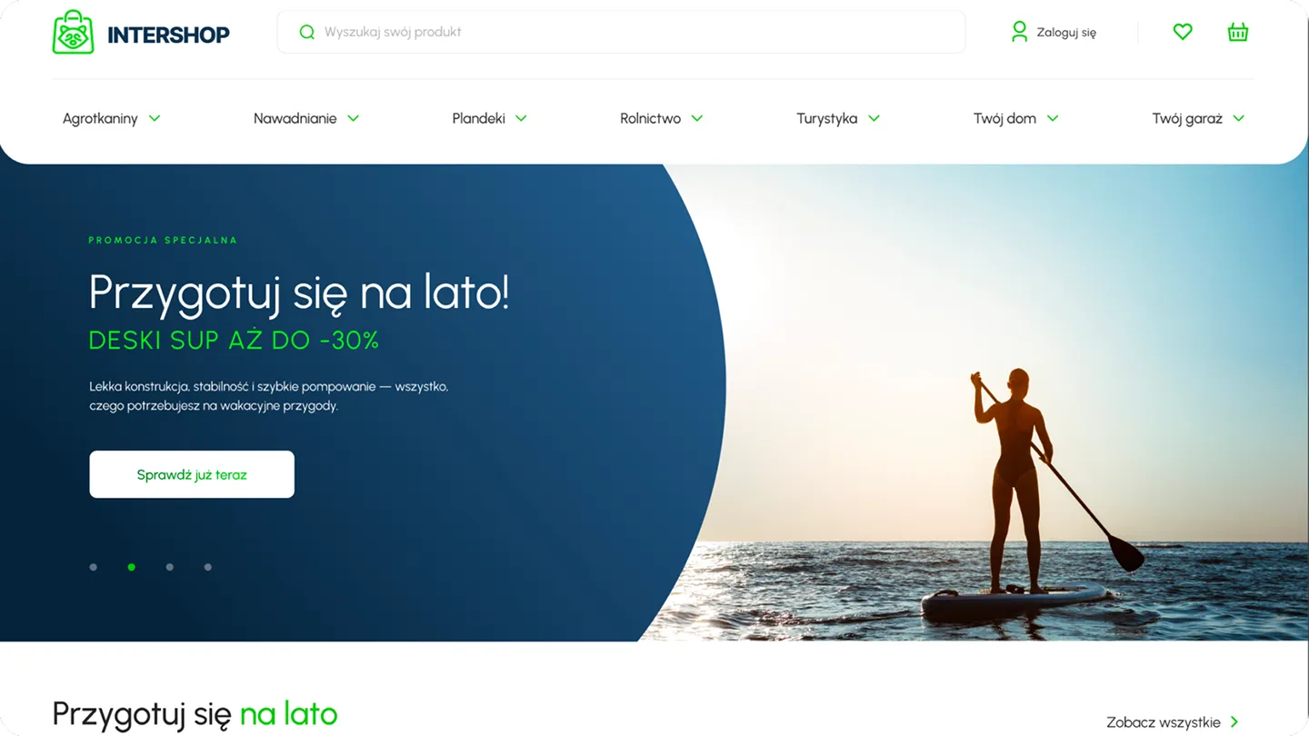

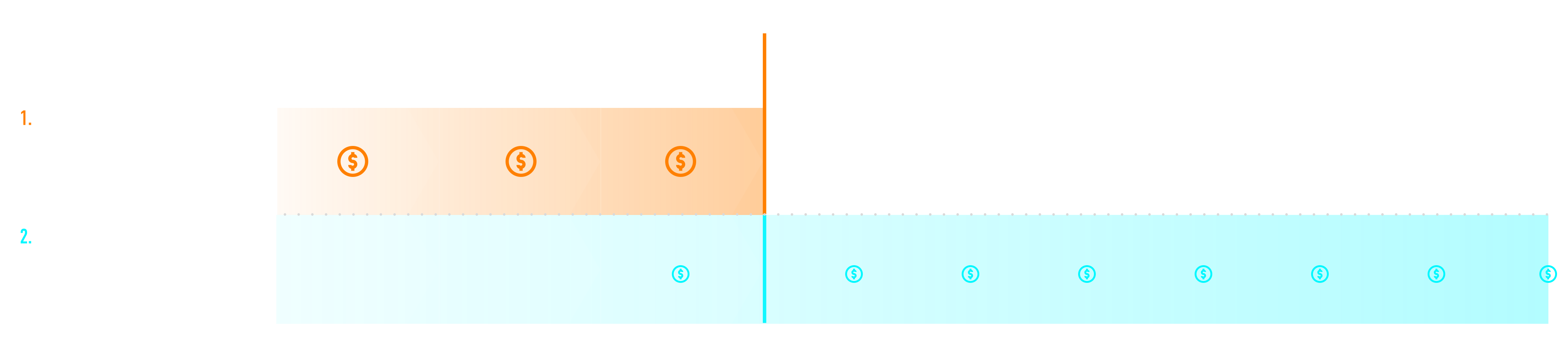
We divide every project into 3 stages. At the end of each stage, you know exactly what has been completed, and only then do we settle the payment. If you prefer to spread the cost over time, we can set up an installment schedule tailored to your business rhythm. We never charge the full amount upfront.
Not because we have to, but because we believe this is how an honest approach to a project should look.
We start by talking about your business
GOAL: To understand how your business works before we write the first line of code.
Website design presentation and implementation
GOAL: Store deployed, integrated, and ready for testing.
We check every detail before launch
GOAL: Before launch, we check every detail. After launch, you can start selling.
For over 5 years, Mariusz has been designing interfaces that not only catch the eye but, more importantly, guide the user exactly where you want them to go. As Head of Design, he oversees every project from the initial sketch to final implementation. He knows how to turn a visitor into a customer.
MEET THE SKY TEAMEvery month, you get a clear picture of your results along with an analysis of the situation
Regular online meetings to discuss results, priorities, and actions
You talk to the specialist who is actually managing your project
You have constant contact with the team via a shared messenger
Clear terms of cooperation. We retain clients with results, not contracts
We suggest directions, tests, and moves that make sense
Strategy, creative, performance, web, and analytics under one roof
We speak clearly, concretely, and without agency jargon


Since we started working with Igor and his team, the store we work on has genuinely grown and, above all, we understood that advertising can be done far better, smarter and more effectively. This is a partnership focused on growth and numbers, not empty promises.


Sky Agency is our third marketing company and we hope it will be the last. They run marketing for our two clothing brands and from the very beginning we felt they treat our cooperation in a truly individual way. Beyond marketing itself, they also help us grow the companies and look at everything much more broadly. What we value most is the communication. It is fast, to the point, and we constantly feel that someone is on top of things. There is never a problem getting an answer or discussing new ideas. You can tell this is built by people who genuinely put their heart and commitment into their work. Working like this simply feels calm and supported, and that matters a lot to us!

I have worked with Sky Agency for several years on various projects – a website, recruitment process automation, SEO. If I had to sum it up in one sentence: this is an agency where there is a real person behind the words, someone who takes responsibility. Igor as CEO does not disappear behind the team when things get difficult. That is rare and I value it. Together we built a tool for managing the recruitment of event staff – an application form, a candidate verification panel, automatic notifications, email integration. It sounds simple. At a scale of several hundred contractors a year and with the specifics of temporary work, it was a complex, non-standard brief. And I will say more: in difficult moments you see who you are really working with. And I do. I recommend them – especially to companies with non-obvious needs looking for someone who will dig deeper than a slide deck.

I recommend working with Sky Agency. Despite a very complex project requiring many custom solutions and integrations, everything was delivered professionally and in line with our expectations. The team stayed engaged throughout the whole process, and all key revisions were implemented until the final result was achieved.
.jpg)
We have been working with Sky Agency since 2022 – SEO, the rmcpolska.pl website and IT development support. More than four years of steady, well-organised cooperation. Igor and the team understood the specifics of our industry and are responsible for growing our online presence – from SEO to the new website we are designing together. IT tickets are handled quickly and without downtime. We value their straightforwardness, industry knowledge and partnership approach. We recommend them to any company looking for an agency that combines marketing with the technical side of business.









Creating online stores is not just about setting up a page with products, adding a cart, and connecting payments. That is not enough. A good online store is a sales system: it guides the user from the first visit, through product selection, all the way to finalizing the order. Without chaos. Without unnecessary steps. Without moments where the customer starts to wonder if it's worth continuing.
In e-commerce, every detail matters. The homepage tells the customer where they have arrived. The category helps them find the right product. The product page answers questions before the purchase. The cart should provide a sense of control. The checkout should be as simple as possible. Payment, delivery, analytics, and automation must work in the background without burdening the user.
As an e-commerce agency, we design and implement online stores that combine strategy, UX, design, technology, SEO, and analytics. We don't treat a store like an online catalog. We treat it as a place where a brand should sell, collect data, develop its offering, and scale marketing activities.
The direction is well-articulated on the new subpage: dedicated mobile-first design, thoughtful product architecture, payment and logistics integrations, and no off-the-shelf templates. This is the right approach, because an online store should not be a random collection of modules. It should be designed for a specific sales model.
Good design is important, but in e-commerce, looks alone are not enough. A store can be aesthetic, modern, and consistent with brand identity, yet still lose sales due to a poorly designed purchasing path. Users don't buy for the sake of aesthetics. They buy when they understand the product, trust the brand, and can move through the process quickly without friction.
That is why we start designing online stores by asking about the business. What are you selling? What do the margins look like? Which products are strategic? Does the customer buy impulsively, or do they compare products for a long time? Does the assortment require filters, variants, configurators, sets, subscriptions, or an extensive product page? Is the store intended to handle local, national, or international sales, B2C, B2B, or a hybrid model?
Only after answering these questions can you design the store's structure. A store with a few premium products looks different from a fashion brand, a store with many categories, an e-commerce site with technical products, or a platform that must integrate inventory, delivery systems, marketplaces, and product campaigns.
An online store should look good, but above all, it should guide the user to a purchase.
The UX of an online store is not just a design decoration. It is the logic of the entire sales process. Users should know where they are, what they can do, how products differ, how much they will pay, when they will receive their shipment, and how to go back to a previous step if they change their mind.
A very apt slogan appears on the new subpage: UX that leads to the checkout. The homepage, product page, cart, and form are the places where a customer decides whether to stay or leave. We design these specific points with the greatest attention, as that is where sales are most often won or lost.
Good e-commerce UX includes clear navigation, logical categories, convenient filters, a transparent product page, visible CTAs, a simple cart, a fast checkout, and clear information about delivery, returns, payments, and availability. These aren't minor details. They are the answers to the questions a user asks before clicking "buy."
If the store doesn't answer these questions, the customer will look for answers elsewhere. Sometimes with the competition.
An online store must be designed for mobile first. Not "adapted" for mobile at the end. Designed for mobile from the very beginning.
Customers scroll through products during breaks, in the evening, while commuting, between meetings, or on the couch. They arrive at the store from an ad on Instagram, TikTok, Facebook, or Google, a newsletter, or a link sent by a friend. If a product page loads slowly, the "add to cart" button gets lost under the description, the delivery form is cumbersome, or payment requires too many steps, sales start to slip away.
The new subpage strongly emphasizes that most traffic from Meta, Instagram, and TikTok campaigns comes from mobile devices, and purchasing decisions are often made on the go. This is crucial for e-commerce design, because a store that looks great on desktop but is frustrating on mobile is not ready to scale sales.
We design mobile layouts with the real user in mind: shorter attention spans, small screens, quick comparisons, and a simple path to purchase. Product pages, variants, photos, descriptions, reviews, delivery, the cart, and checkout must all work intuitively on a phone. No zooming. No searching. No frustration.
Store architecture determines whether a user finds a product quickly and whether Google understands the structure of your offer. It is one of the most important stages of building an e-commerce site, yet one of the easiest to overlook.
A good category architecture is not created by randomly grouping products. It should be based on the product range, search behavior, customer intent, seasonality, margins, SEO keywords, and purchasing logic. A category is not just a folder for products. It is a page that can generate organic traffic, help users choose, and support advertising campaigns.
When designing a store, we analyze categories, subcategories, filters, product variants, naming conventions, menus, internal linking, and paths to key areas. We verify that a user can move from a general need to a specific product without getting lost on the site.
On the new subpage, the process begins with a briefing, competitor and market analysis, defining the target audience, and establishing the store architecture and category map. This is the right order, as you must understand the business before designing the layouts.
The product page acts as your salesperson. It must showcase the product, explain its value, address doubts, and lead the user to the cart.
A good product page is more than just a photo, a price, and a button. It should include clear images, variants, a description, key features, benefits, availability, delivery times, shipping costs, return policies, reviews, recommendations, related products, and a clear CTA. Depending on the industry, it may also require technical tables, manuals, videos, comparisons, certificates, or an FAQ section.
In e-commerce, the product page is often the first subpage a user sees after clicking on a product ad or a Google search result. You cannot assume they know the brand, understand the category, or know why the product makes sense. The page must guide them from interest to decision.
A poor product page doesn't always look bad. Sometimes it is simply incomplete. It lacks the arguments a user needs to make a purchase without contacting customer support.
The cart and checkout are not the place for design experiments. This is the stage where the user is closest to making a purchase, so any extra step, unclear message, or surprise can cost you the transaction.
A good cart should clearly display products, quantities, prices, discounts, delivery, estimated costs, and order editing options. The checkout process should be simple, fast, and secure. Customers must know what to enter, which delivery method to choose, how they can pay, and what happens after placing an order.
When auditing and designing the purchasing path, we focus on form length, guest checkout options, error visibility, field order, trust signals, delivery and payment choices, mobile responsiveness, and page load speed.
On the new subpage, testing the purchasing path is indicated as part of the "Testing and Launch" phase. This is important because, before going live, a store should be verified not just visually, but functionally—from landing on a product page to confirming the transaction.
There is no single best e-commerce platform for everyone. There is only the platform best suited to a specific business, team, budget, product range, and growth plan.
The new subpage highlights work with platforms including WooCommerce, Shopify, PrestaShop, and Magento, describing the choice of technology as a decision based on the scale and specifics of the business. This is an excellent approach, as technology should serve sales, not the other way around.
WooCommerce is a great fit for WordPress-based stores where flexibility, site control, content growth, and reasonable maintenance costs are priorities. It is a solid choice for many brands looking to combine an online store, a corporate website, a blog, SEO, and custom solutions.
Shopify is often a good choice for brands that want to start selling quickly and take advantage of a ready-made ecosystem of apps, integrations, and a stable technological backend. It works particularly well where speed of implementation and ease of use are priorities.
PrestaShop may make sense for more extensive catalogs, a larger number of products, and more complex requirements regarding categories, pricing, promotions, or store logic.
Magento is a solution for large e-commerce platforms with complex structures, individual processes, and higher technological requirements.
Shoper can be a good solution for companies that want to leverage the Polish sales ecosystem and need a faster launch without building many elements from scratch.
The choice of platform should be based on real needs, not trends. A solution that is too simple can limit growth. One that is too complex can increase costs and complicate daily operations.
A ready-made template might be fast and cheap at the start, but it often imposes limitations. The problem arises when the store starts to grow: you need to change the product page layout, rebuild the checkout, add a unique section, improve mobile performance, highlight an offer, or align the design with your brand.
A custom design provides greater control. It allows you to design a store for a specific target audience, a specific product range, and a specific customer journey. You don't have to force your brand into a pre-set framework. You can design the homepage, categories, product pages, cart, and checkout to meet the real needs of your customers.
The new subpage delivers a strong message: no ready-made templates and no compromises on UX. The previous content also emphasized that the UX/UI design is prepared individually by a dedicated designer, without using pre-made templates. This is worth keeping, as it is a key advantage in building stores that are meant not just to launch, but to grow.
A custom design doesn't mean overcomplicating things. It means designing exactly the elements needed to make the store clear, fast, and effective.
An online store doesn't run on its own. To ensure sales run smoothly, it must connect with payments, shipping, inventory, analytics, advertising systems, marketing automation tools, marketplaces, and often a CRM or ERP.
As part of our e-commerce store implementation, we configure the integrations necessary for daily operations. This can include payments like BLIK, Google Pay, Apple Pay, and Tpay, as well as shipping integrations, InPost, Orlen, BaseLinker, inventory systems, invoicing tools, newsletters, automation, Google Merchant Center, Meta Pixel, GA4, and Google Tag Manager.
The new subpage highlights payment and logistics integrations, as well as analytics, with examples like BLIK, Google Pay, Apple Pay, Tpay, BaseLinker, InPost, and Orlen. This is important because the store needs to be ready not just to display products, but to handle actual order fulfillment.
Good integrations save time, reduce errors, and allow you to grow sales without manually moving data between systems. The faster your store grows, the more important it is to have an organized backend.
Without data, a store is operating in the dark. You might see orders, but you won't understand where customers came from, where they abandon their carts, which products drive traffic, which campaigns are actually selling, and where the store is losing potential.
That’s why e-commerce analytics must be implemented before launch, not months later. We configure GA4, Google Tag Manager, Google Merchant Center, Meta Pixel, and the events needed to track sales and user behavior. This allows you to analyze transactions, traffic sources, products, carts, clicks, conversions, and marketing channel performance from day one.
The new subpage emphasizes tracking from day one: GA4, GTM, Google Merchant Center, and Meta Pixel must be configured before launch, not only when a problem arises. This is crucial because, without accurate data, it’s difficult to optimize campaigns, SEO, UX, and sales.
Data isn't just an add-on for your store; it’s its nervous system. It shows you where the store is making money, where it’s leaking revenue, and what needs to be improved first.
An online store should be designed with SEO in mind from the start. Not after implementation, not after a campaign launch, and not when you realize Google isn't indexing important categories. E-commerce SEO must be baked into the store's structure.
E-commerce SEO optimization includes category architecture, URLs, metadata, headings, category descriptions, product descriptions, internal linking, indexing, structured data, sitemaps, loading speed, Core Web Vitals, mobile optimization, and avoiding duplicate content.
Categories are particularly important. They often hold the greatest organic potential because they address specific shopping queries. A good category page should help the user choose a product while clearly communicating to search engines what that section of the store is about.
E-commerce SEO is not just about adding a few paragraphs below a product list. It is about building a structure that makes sense for the user, for Google, and for sales.
The speed of an online store impacts user experience, advertising campaigns, SEO, and conversion. If a store loads slowly, a user may leave before even seeing the product. If elements shift while loading, frustration grows. If the checkout process is laggy, the risk of cart abandonment increases.
That is why, during the build process, we focus on technical optimization: lightweight images, proper resource loading, minimizing unnecessary scripts, code quality, layout stability, mobile performance, and the fundamentals of Core Web Vitals.
Technical optimization is essential: category structure, on-site SEO, loading speed, and Core Web Vitals compliance. These are not "later" tasks. They should be part of the store's implementation from the very beginning.
A store that aims to grow must have solid technical foundations. Otherwise, every subsequent campaign will send users to a site that fails to reach its full potential.
An online store should be ready for traffic from Google Ads, Meta Ads, TikTok Ads, LinkedIn Ads, SEO, email marketing, and social media. Each of these channels may bring in a user at a different stage of the decision-making process. One might be ready to buy, another might still be comparing options, a third might be returning after remarketing, and a fourth might be seeing the product for the first time.
That is why we design stores to handle various types of traffic effectively. A product page must work for a user coming from a product ad. A category page must handle SEO traffic. A product landing page can support a seasonal campaign. The homepage must quickly explain the brand to new visitors. The cart must drive sales regardless of the traffic source.
A well-designed store facilitates future campaigns. Ads can leverage better data, remarketing events become more meaningful, Google Merchant Center receives organized product data, and analytics reveal which channels are actually driving sales.
Launching your store is not the end of the project. It is the beginning of data collection.
Only after launch can you see how users truly interact with your store: which products they view, where they click, where they drop off, which categories are growing, which campaigns drive traffic, which page elements need improvement, and whether the checkout process creates unnecessary barriers.
E-commerce CRO, or conversion rate optimization, involves systematically improving your store based on data. This can include A/B testing, enhancing product pages, changing category layouts, simplifying forms, better showcasing reviews, optimizing filters, improving CTAs, shortening the checkout process, or developing content that supports purchasing decisions.
Growth and support have become key: CRO, A/B testing, data analysis, and tailoring the store to advertising campaigns. This is a crucial element, as an online store should not be frozen in time after launch. The best e-commerce sites grow through iteration.
Designing a store for a launch is different from designing one for a brand that is already selling and wants to reach the next level. In the first case, what matters is a fast, sensible implementation of the foundations. In the second, you often need to rebuild the structure, improve UX, enhance analytics, add integrations and automation, migrate data, and prepare the store for higher traffic.
If a store is to scale sales, it must be ready for more than just the first few orders. It should support a larger number of products, seasonal campaigns, promotions, discount codes, cross-selling, up-selling, remarketing, product catalogs, marketplace integrations, automated order statuses, and analytics that show profitability.
Scaling e-commerce is not just about increasing your advertising budget. If the store lacks a solid foundation, more traffic may only expose its weaknesses faster.
A new online store doesn't need to have every possible feature right away. It should have those necessary for sales, data collection, and further growth.
At launch, the most important things are: a well-organized offer, simple architecture, a clear product page, a convenient cart, efficient payments and shipping, correct analytics, SEO basics, a mobile version, and a consistent design. It is better to start with a well-thought-out foundation than an overloaded store that is difficult to develop later.
A good e-commerce launch should leave room for future stages: expanding categories, automation, advertising campaigns, SEO content, new integrations, and conversion testing.
Sometimes the problem isn't the lack of a store, but an old one that can no longer keep up with the business. It loads slowly, has an outdated checkout, doesn't work well on mobile, limits advertising campaigns, has chaotic categories, or makes product management difficult.
Rebuilding an online store requires caution. You must preserve what is already working: SEO visibility, URLs, product data, order history, integrations, and key sales sources. At the same time, you need to improve what is hindering growth.
During migration, we analyze the current structure, traffic, rankings, categories, products, redirects, data, technology, and sales processes. This ensures the new store is better without losing the achievements of the previous version.
Building an online store involves much more than just graphic design and system implementation. It is a process that combines sales strategy, UX, UI, technology, integrations, SEO, and analytics.
As part of our e-commerce development services, we can handle, among other things:
This scope allows you to build a store that goes beyond just a pretty front end. It includes the back end, data, integrations, and the sales funnel.
We start the process with a briefing. We talk about the business, products, customers, margins, competition, logistics, payments, current challenges, and growth plans. We want to understand how the store is intended to generate revenue before the first design is even created.
Next, we plan the structure. We create the category architecture, product map, navigation logic, and requirements for key views. This is the stage where we organize the store from the inside out.
Then we move on to UX/UI design. We prepare mobile and desktop views, design the homepage, categories, product pages, cart, checkout, and other elements required for the specific sales model. We ensure the design is consistent with the brand, but above all, user-friendly.
The next stage is implementation. We build the store on the chosen platform and configure the system, products, payments, delivery, integrations, and analytics.
Finally, we test the store before launch. We check the purchasing journey, forms, payments, delivery, mobile responsiveness, speed, tracking, and basic user scenarios. Only after such verification should the store go live. On the new subpage, the process is broken down into three stages: briefing, implementation, and testing/launch, including competitor analysis, store architecture, integrations, analytics, and UX optimization.
Building an online store is an investment, so the cooperation model should be transparent. The client should know what is being created at each stage, what they are paying for, and when they can evaluate the results.
The new subpage indicates that the project is divided into three stages, with payment due upon completion of each. There is also the option to spread costs over time, aligned with the business rhythm, without requiring the full amount upfront. This is worth emphasizing, as financial transparency is highly significant in e-commerce projects.
This model provides greater control over the project. Instead of one large payment at the start, the client sees progress and signs off on individual project phases. It is a fairer, more partnership-based approach to a project that has a real impact on a company's sales.
Before launch, a store must be tested exactly as it will be used by real customers. It is not enough to just check if the pages load. You have to go through the entire purchasing journey.
We test adding products to the cart, variants, discount codes, forms, delivery options, payments, error messages, transactional emails, mobile performance, loading speed, analytics, conversion events, and integration accuracy.
In e-commerce, a small mistake can have major consequences. If payment doesn't work, the user won't buy. If the delivery form is unclear, they will abandon their cart. If tracking fails, you won't know where your sales came from. If the store looks bad on mobile, paid campaigns will lose some of their potential.
That is why the launch should be a calm moment following thorough testing, rather than a leap into the unknown.
An online store should not be designed in isolation from marketing. It is the destination for your Google Ads, Meta Ads, TikTok Ads, SEO, email campaigns, social media, and remarketing efforts. If the store isn't ready for these channels, marketing will be more expensive and less effective.
A good e-commerce agency should understand how a store will sell after launch. Will products be fed into Google Merchant Center? Will ads lead to categories, products, or landing pages? Is the Meta Pixel collecting the right events? Does SEO have a prepared category structure? Can email marketing recover abandoned carts? Does analytics show channel profitability?
The new subpage clearly highlights the advantage of a broad approach: strategy, creative, performance, web, and analytics all under one roof. This is particularly important for online stores, as e-commerce is about more than just the implementation. It must be prepared for traffic and optimization.
A good e-commerce agency shouldn't just ask about button colors and the number of subpages. They should ask about margins, strategic products, traffic sources, order fulfillment, logistics, payments, advertising campaigns, SEO, analytics, and the client's internal workflow.
Creating online stores requires a combination of skills: UX, UI, development, SEO, CRO, analytics, and marketing. If any of these elements are overlooked, the store might look good, but it won't perform as it should.
It’s not about building the best-looking store in the industry. It’s about building a store that users understand, Google can index, your team can manage, and marketing can scale.
You might need your first online store, a rebuild of your current e-commerce site, a migration to a different platform, a better mobile version, checkout improvements, payment and logistics integrations, or a store optimized for advertising campaigns and SEO.
We will prepare an online store design based on a real sales model: strategy, category architecture, UX/UI, mobile-first, technology, integrations, analytics, SEO, and pre-launch testing. We will ensure that the store is not just a place to showcase products, but a sales channel that can be scaled.
A good online store doesn't end with the launch. It starts working when users begin to buy, data starts revealing customer decisions, and further optimizations boost results. This is exactly how e-commerce development should look: fewer random features, more conscious sales design.
Do you have a store, service, or brand you want to genuinely grow online?
Head over to our simple contact form and let us know what you need today.
We will get back to you with a concrete proposal for next steps and a time for a brief call.