
We'll call you back
S-Net
Web Design
Website
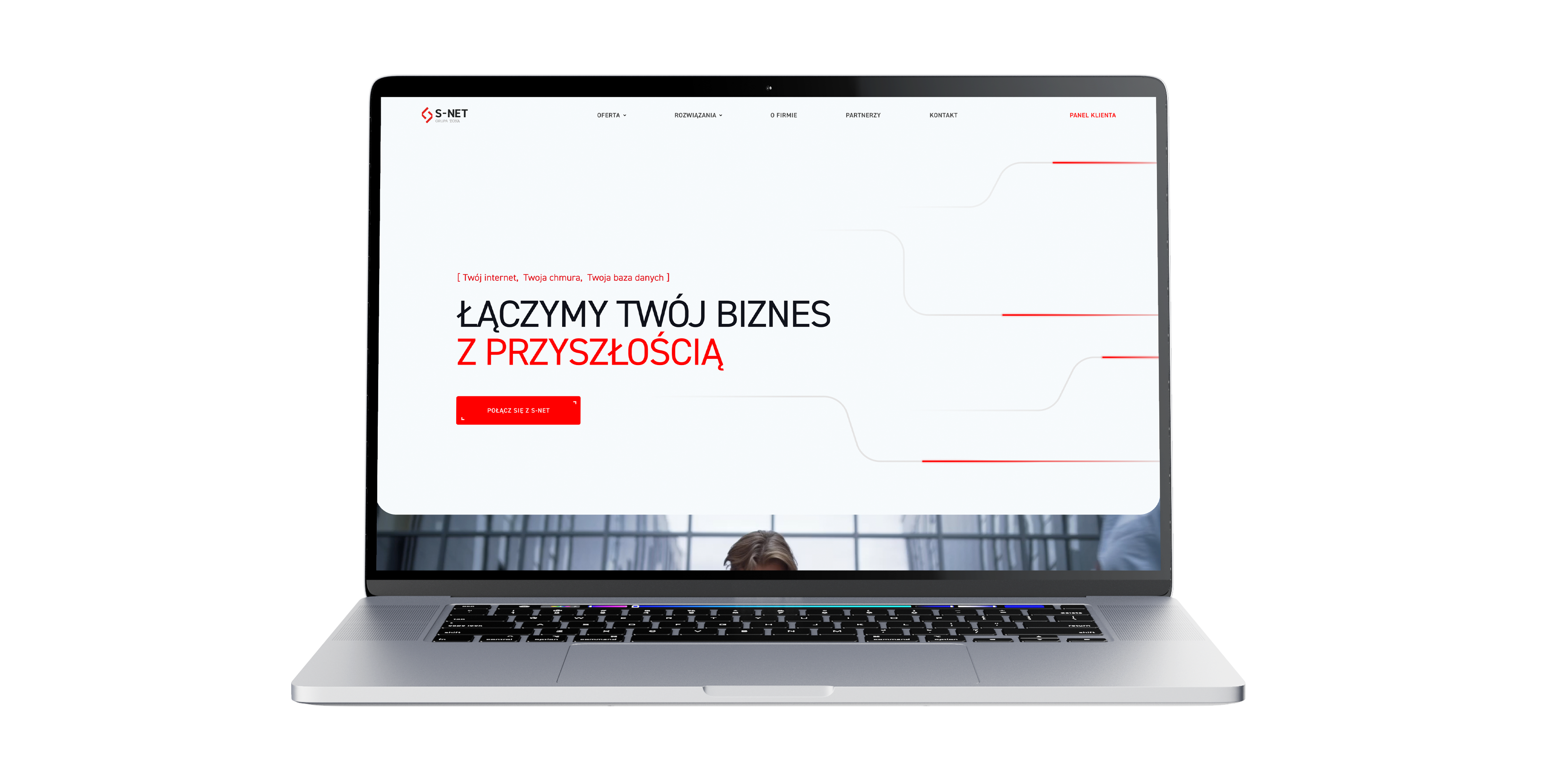
A project to build a new website from scratch for a telecommunications and IT brand, combined with a light refresh of its branding and communication. The goal was to better organise a very broad offer, shorten the route to contact and design a modern site that presents business services more effectively and puts the information architecture in order.
No items found.
About the brand
S-NET is a brand operating in telecommunications services, data centres, hosting, cloud and IT outsourcing for businesses. In this project it was important to keep the brand's business character while giving it a more modern, organised and readable form, better matched to its broad service range and B2B audience.
Our scope of work
What we do




As part of the project we were responsible for designing the new site from scratch and lightly refreshing the brand's identity and communication. The key was creating a site that would not be merely a new visual layer, but would genuinely organise the offer and improve how people move around it. S-NET's service range is very broad and covers telecommunications, data centres, cloud servers, hosting, outsourcing and solutions for specific business types, which is why information architecture was one of the most important elements of the whole project.
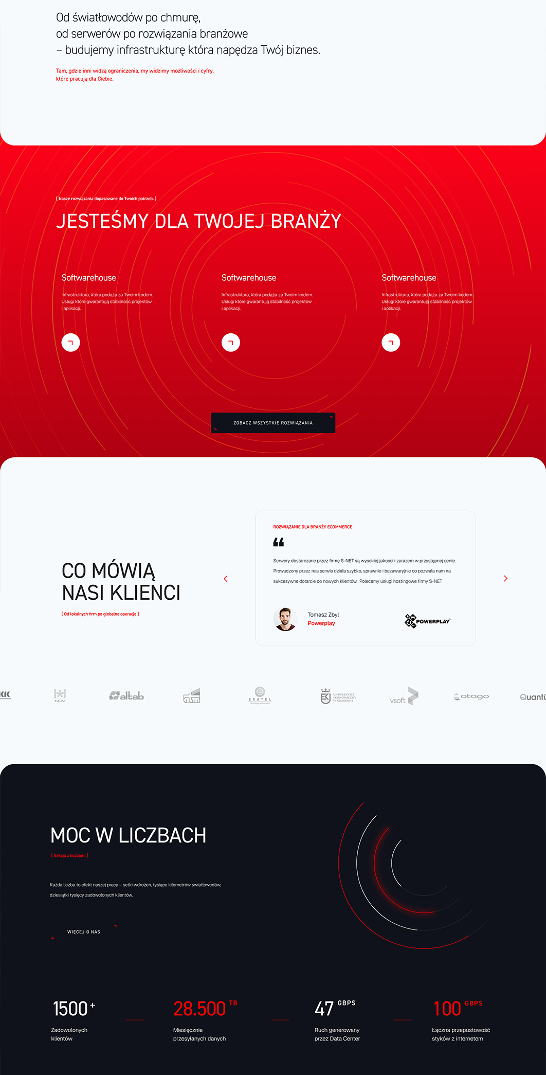
We put a lot of emphasis on shortening the user's route to the form and guiding them through the offer better right from the homepage. Motion elements and interactive sections also played an important role, building a modern perception of the brand without losing readability. At the same time the site was thought through in terms of SEO and the structure of entry points into services, so it works better both commercially and informationally. Publicly you can see an extensive offer menu, an "IT service configurator" section, separate entry points into industry solutions and numerous service and configuration subpages.
Your customer isn't sitting at a desk
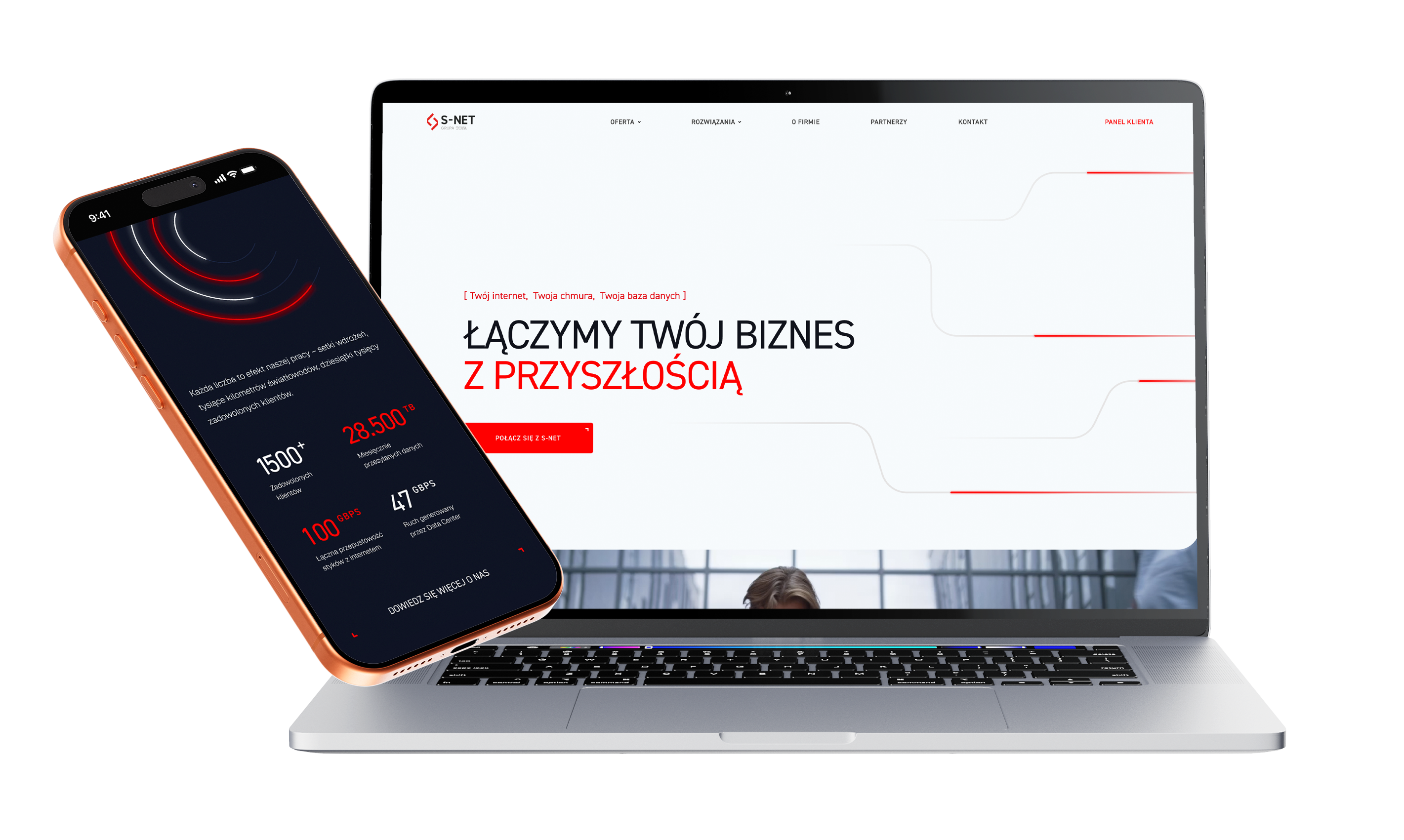
Mobile isn't a trend, it's where sales happen

1.
A fast route to the right service
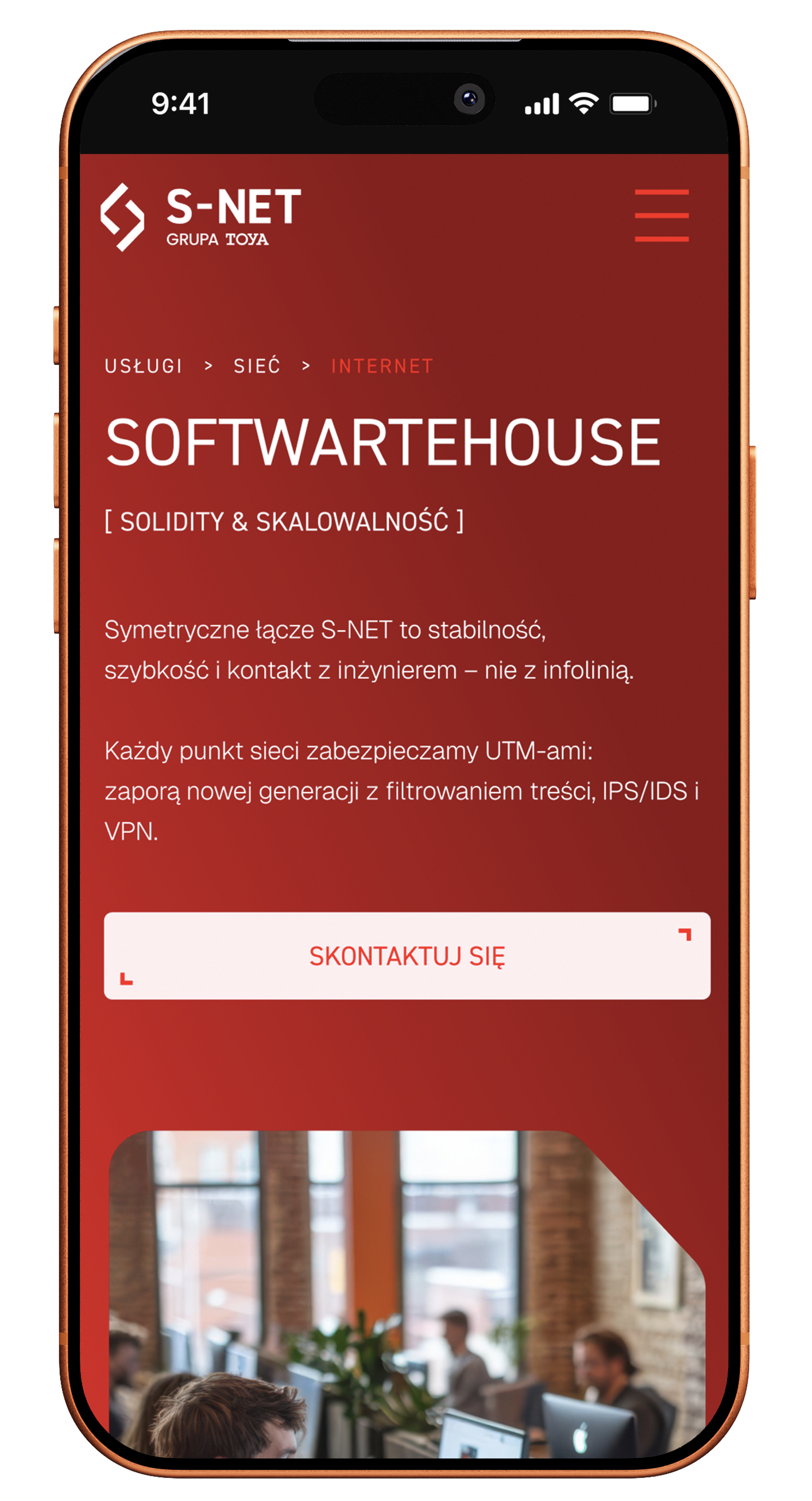
On a phone, users should not have to push through too many levels of the offer to find the right area of support. That is why the mobile views were laid out to direct people to the right type of service faster and shorten the distance to contact.
2.
Mobile designed for a broad architecture
In this project the challenge was not aesthetics itself, but moving a large number of services, categories and solutions into a layout that still stays readable on a small screen. Keeping users oriented despite the site's broad structure was crucial.
3.
Motion and interaction with readability intact
The site uses motion elements and a more modern way of guiding sections, so on mobile it was important to keep the experience smooth without losing usability. The interface had to look modern while still leading to specifics and action.
Scope of our work
Dedicated solution
An important element of the project was the offer architecture combined with interactive entry points into services. The site was designed so that, with such a broad range of solutions, it leads users to specific areas of support by the shortest possible path, while reinforcing that process with extra elements such as an interactive coverage map and an IT service configurator visible on the homepage.

I was looking for a good team to run our website. I wanted someone who would know what to do to turn it into profit and enquiries from new clients. Igor and his team are exactly those specialists.
Together, we made it happen
Brands that chose sky









TIME FOR THE NEXT STEP
CONTACT US
Do you have a store, service, or brand you want to genuinely grow online?
Head over to our simple contact form and let us know what you need today.
We will get back to you with a concrete proposal for next steps and a time for a brief call.