
We'll call you back
Furnidea
Website
Custom Solution
E-Commerce
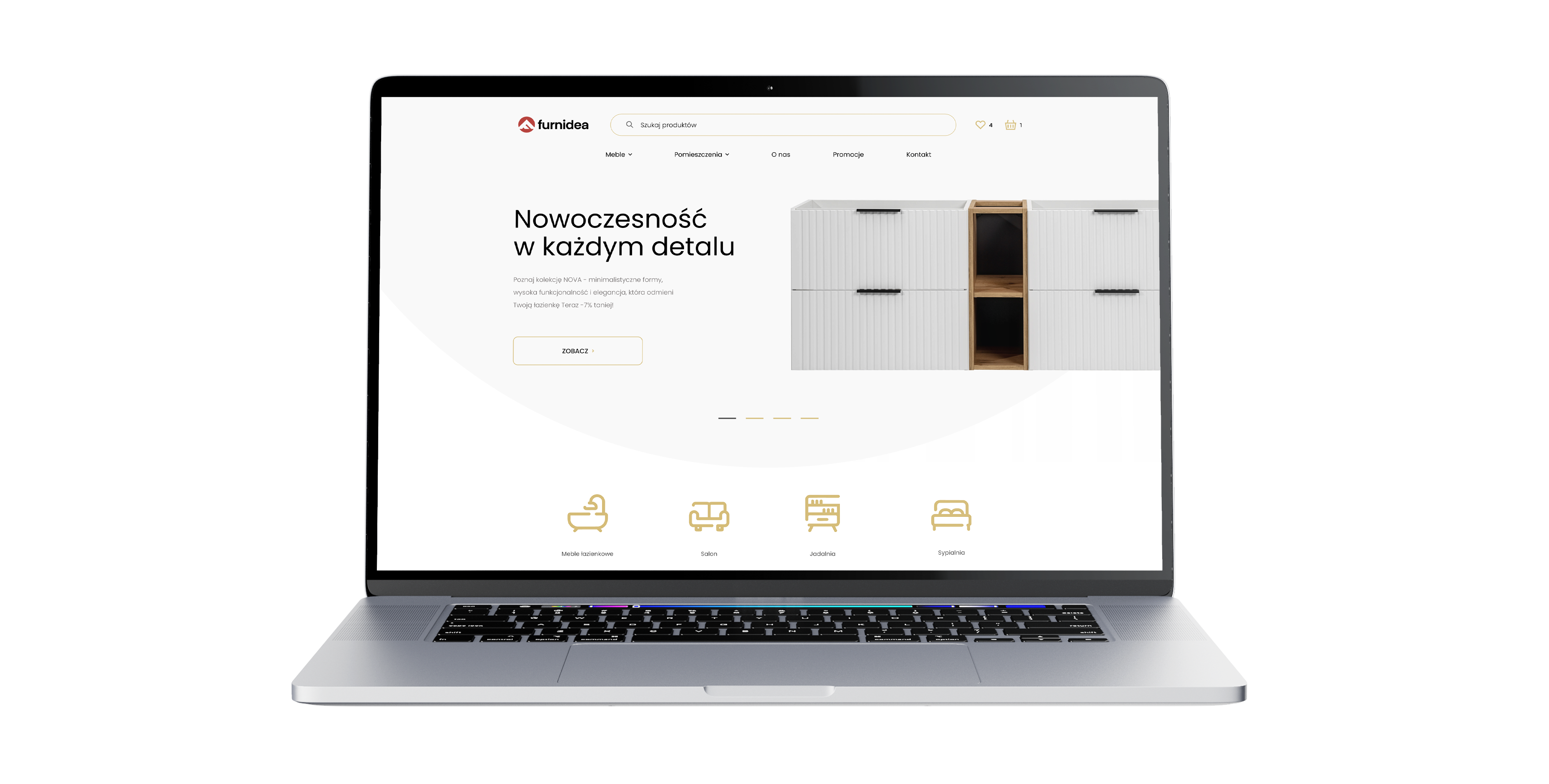
An online store implementation for a furniture brand, with an emphasis on clear presentation of the collections, convenient navigation and an organised purchase path.
The goal was to create an experience that showcases the product well, organises the offer and makes it easier for customers to move from inspiration to purchase.
No items found.
About the brand
Furnidea is a home furnishings brand focused on selling furniture online. In this project the key was combining an attractive presentation of the products with a sales function,
so the store would not only showcase the collections well but also make it easier for users to move around the offer and get to a purchase quickly.
Our scope of work
What we do





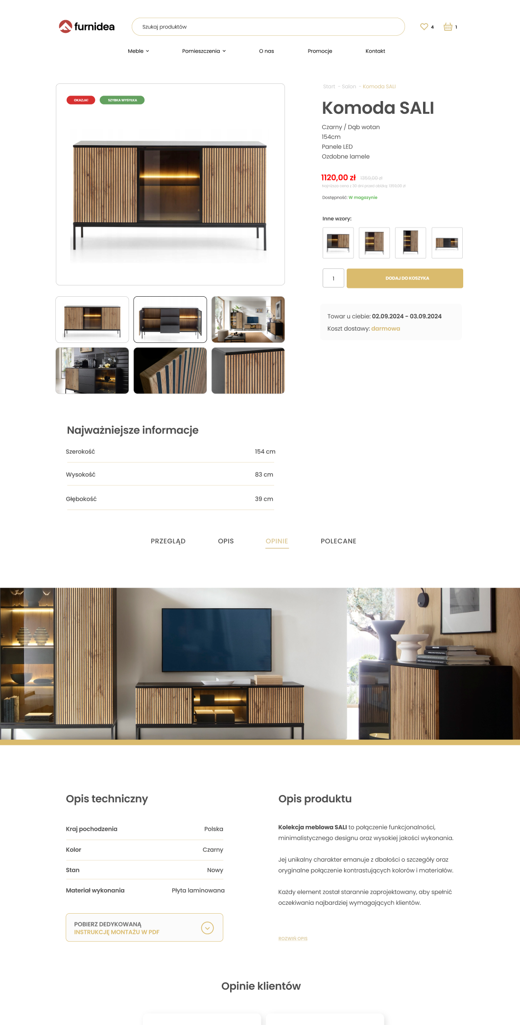
In furniture e-commerce it is not only the product that matters but also the way it is shown. Users should quickly understand what exactly they are looking at, what options they have and whether a given model suits their needs and their space. That is why in the Furnidea project we focused on creating a store that organises the offer and guides users through the whole process intuitively.
We put a lot of emphasis on a clear presentation of the collections, a logical category structure and transparent product cards. We wanted the interface not to compete with the product itself, but to reinforce how it is perceived and make comparing the available options easier. As a result the store builds a more organised shopping experience and showcases the brand's offer better online.
The result was an implementation that combines an image-building function with real commercial usefulness. The project was planned so users can comfortably explore the offer, reach the products they are interested in faster and move through the next steps of the purchase path more efficiently.
Your customer isn't sitting at a desk
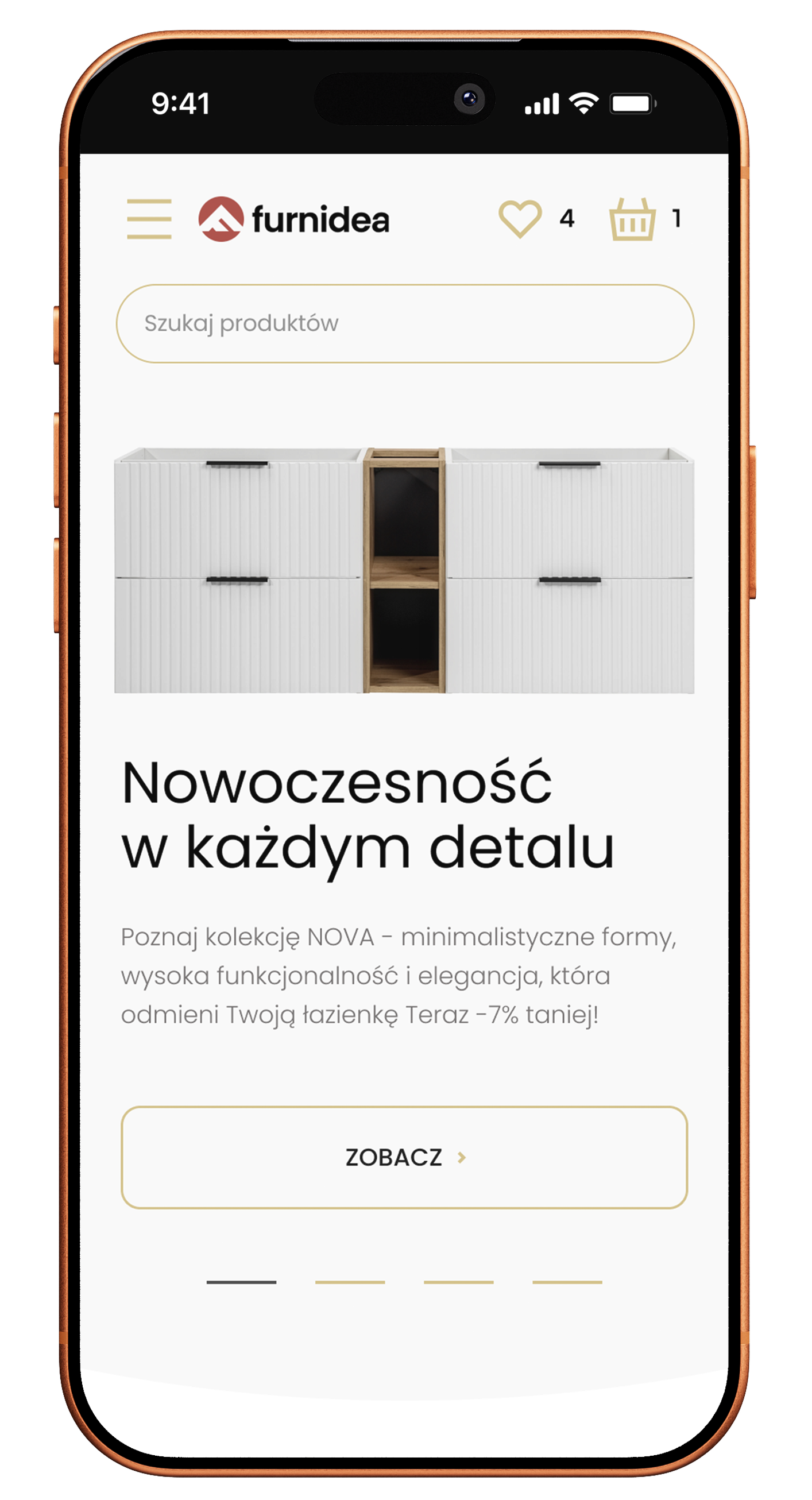
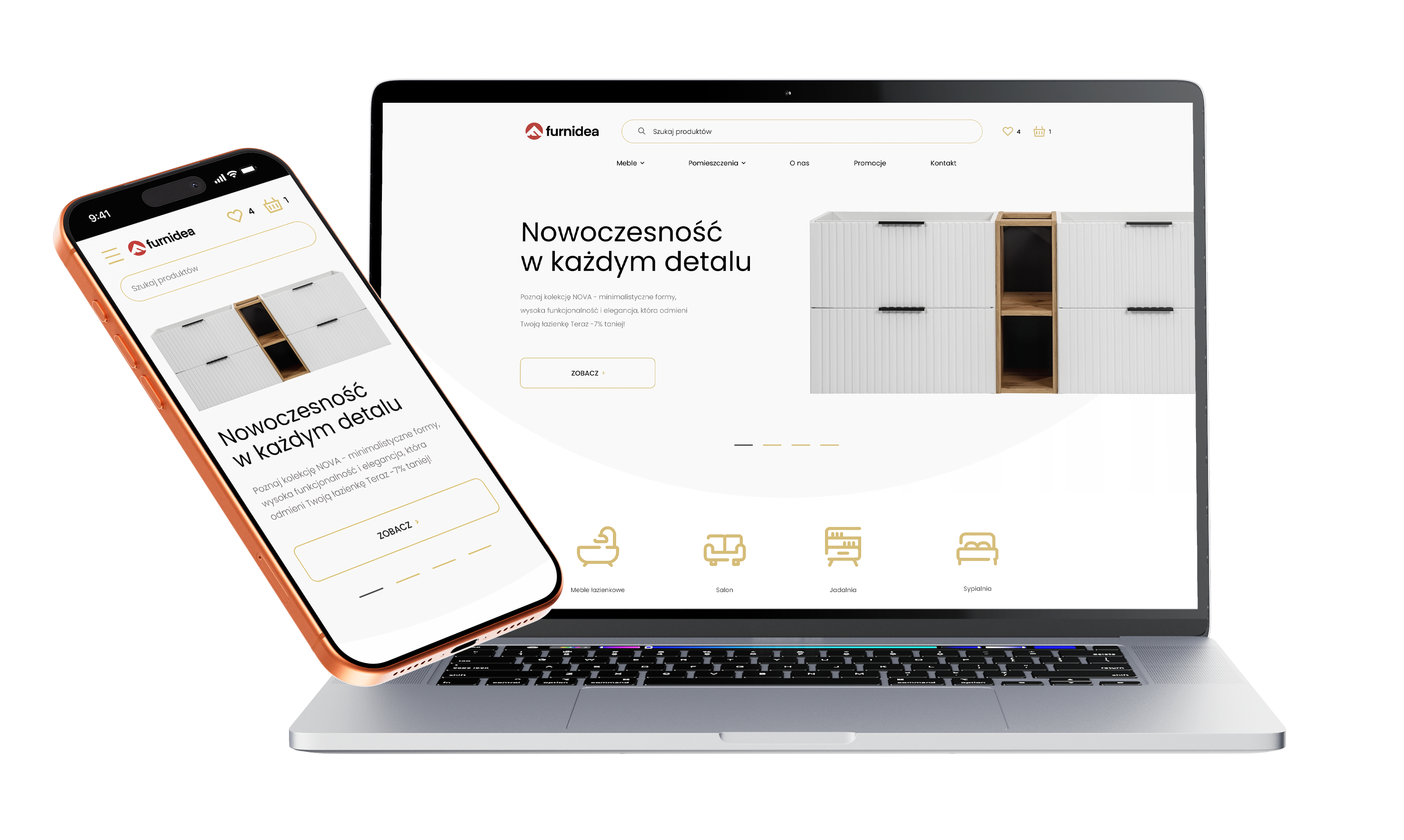
Mobile isn't a trend, it's where sales happen

1.
Clear product presentation
On mobile devices it was crucial to keep the layout clear and the information hierarchy right. Users have to see the product, its variants and the key details quickly, without pushing through an overly heavy interface.
2.
A shorter route to the offer
The project's UX was arranged to shorten the distance between landing on the site and reaching a specific category or product. That matters especially on mobile, where decisions are faster and users have less patience.
3.
A more comfortable shopping experience
The whole layout was adapted to the natural way people use a phone. The right proportions of elements, simpler navigation and organised content improve the comfort of browsing the store and support the move to purchase.
Scope of our work
Dedicated solution
In this project we implemented a mechanic that supports productising the offer and increasing cart value by suggesting additional products from the same collection.
As a result the store does not present single items alone but helps build coherent sets, increases the chance of buying more products and supports growth in both cart value and the number of conversions.

Since we started working with Igor and his team, the store we work on has genuinely grown and, above all, we understood that advertising can be done far better, smarter and more effectively. This is a partnership focused on growth and numbers, not empty promises.
Together, we made it happen
Brands that chose sky









TIME FOR THE NEXT STEP
CONTACT US
Do you have a store, service, or brand you want to genuinely grow online?
Head over to our simple contact form and let us know what you need today.
We will get back to you with a concrete proposal for next steps and a time for a brief call.