
We'll call you back
E-Kaspar
E-Commerce
Rebranding
Website
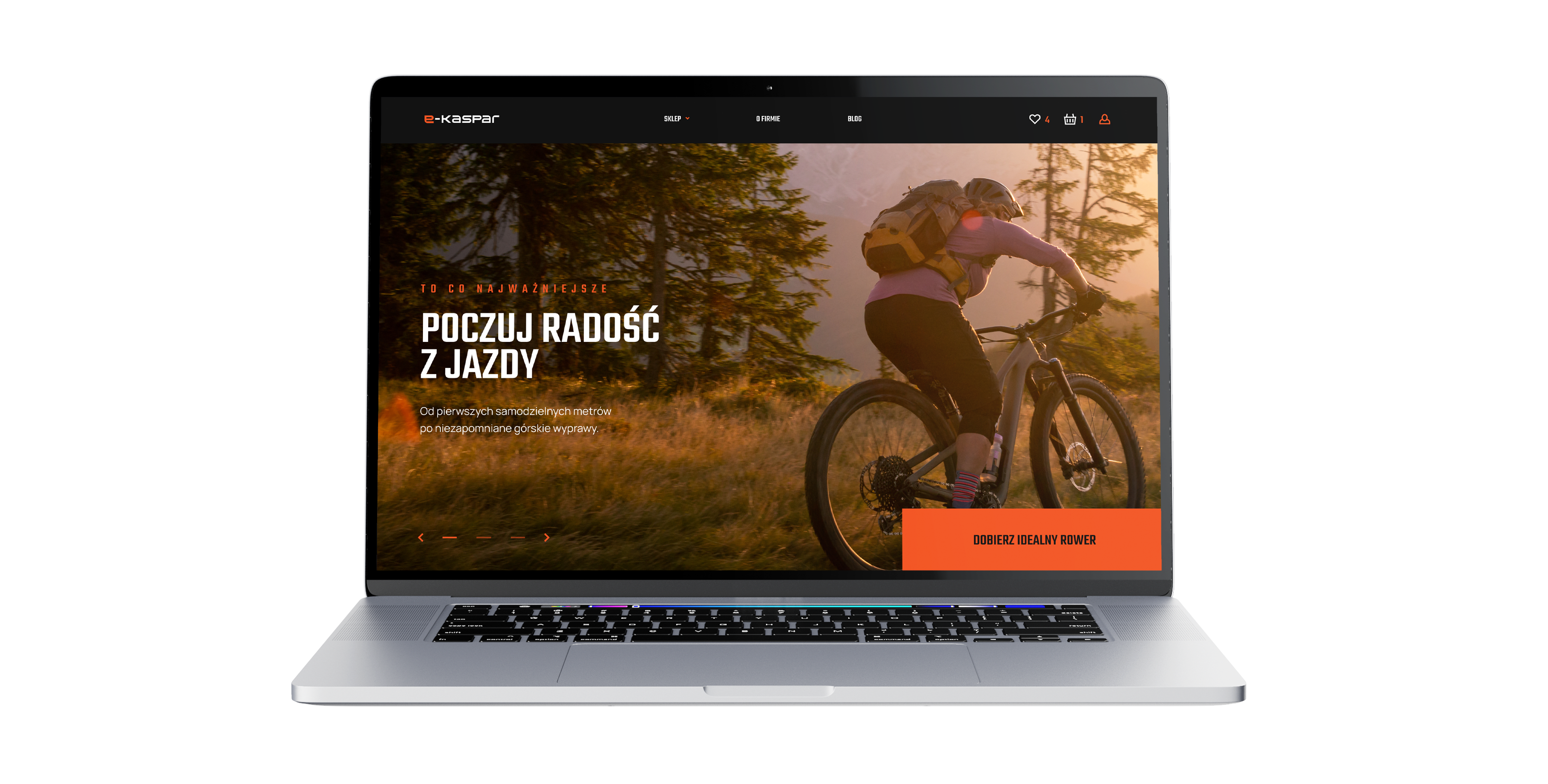
A comprehensive rebranding and new online store project for a bicycle industry brand, covering the creation of a new visual identity, UX, design and the entire e-commerce environment from the ground up. The goal was to build a modern, high-performance and scalable store that organises the offer, makes choosing a bike easier and supports further growth of online sales.
No items found.
About the brand
E-kaspar is a bicycle industry brand with many years of experience in online sales. In this project the key was not only refreshing the image but fully building a new quality for the brand in digital – from branding, through communication, to a new online store that better answers the needs of modern e-commerce.
Our scope of work
What we do





As part of the project we handled the brand's full rebranding, covering a new logo, colour palette, branding and a refresh of all visual communication. We then designed and implemented a new online store from the ground up, creating the entire UX, design and target e-commerce environment that was to replace the previous solution and represent a genuine step forward for the business.
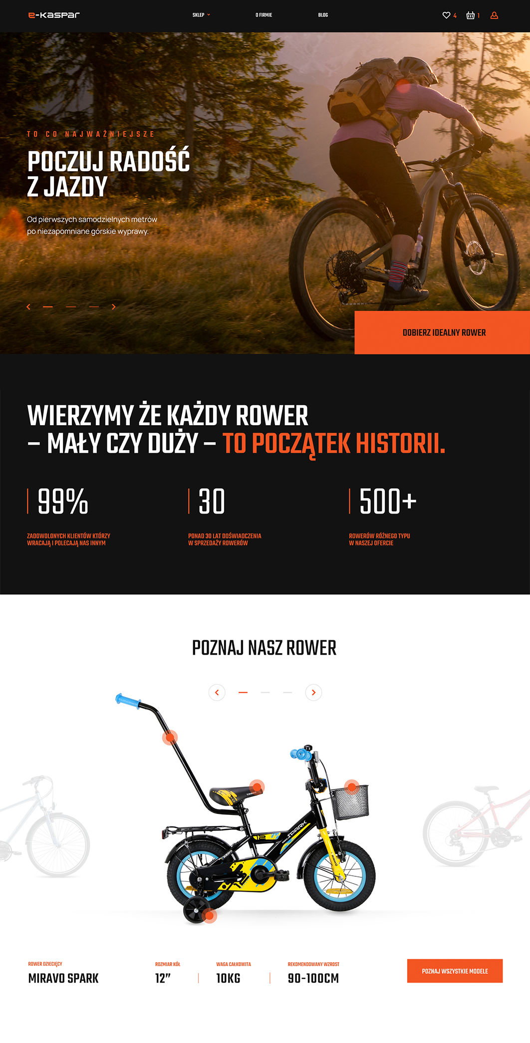
The project was not just about changing how the store looks. The key was organising the offer, improving site performance and building a shopping experience that guides users better through the process of choosing a bike. That mattered especially for children's bikes, where the purchase decision rests on very specific parameters such as age, height, size or the model's intended use.
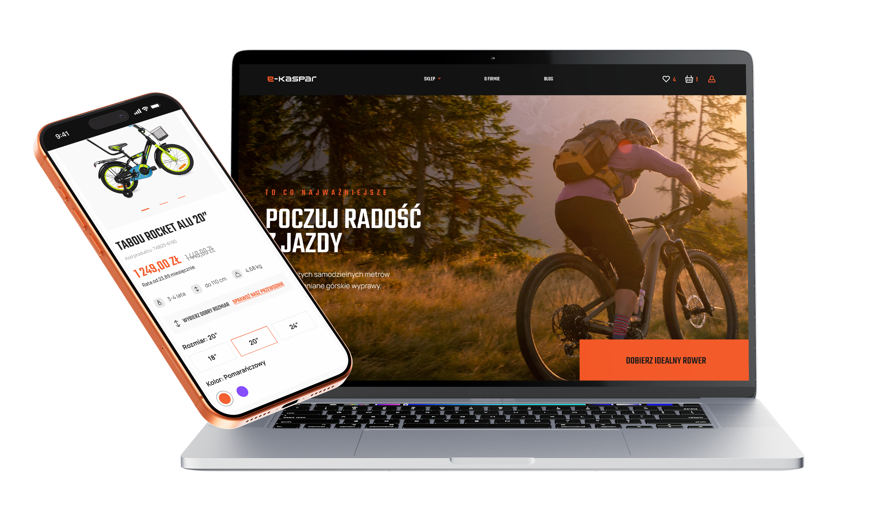
We put a lot of emphasis on how products are presented, on expanding the product cards and on better surfacing the information that genuinely helps in choosing a bike. In parallel we designed the store to reinforce the new perception of the brand, organise its communication and create a coherent link between branding, usability and the sales function of the whole implementation.
Your customer isn't sitting at a desk
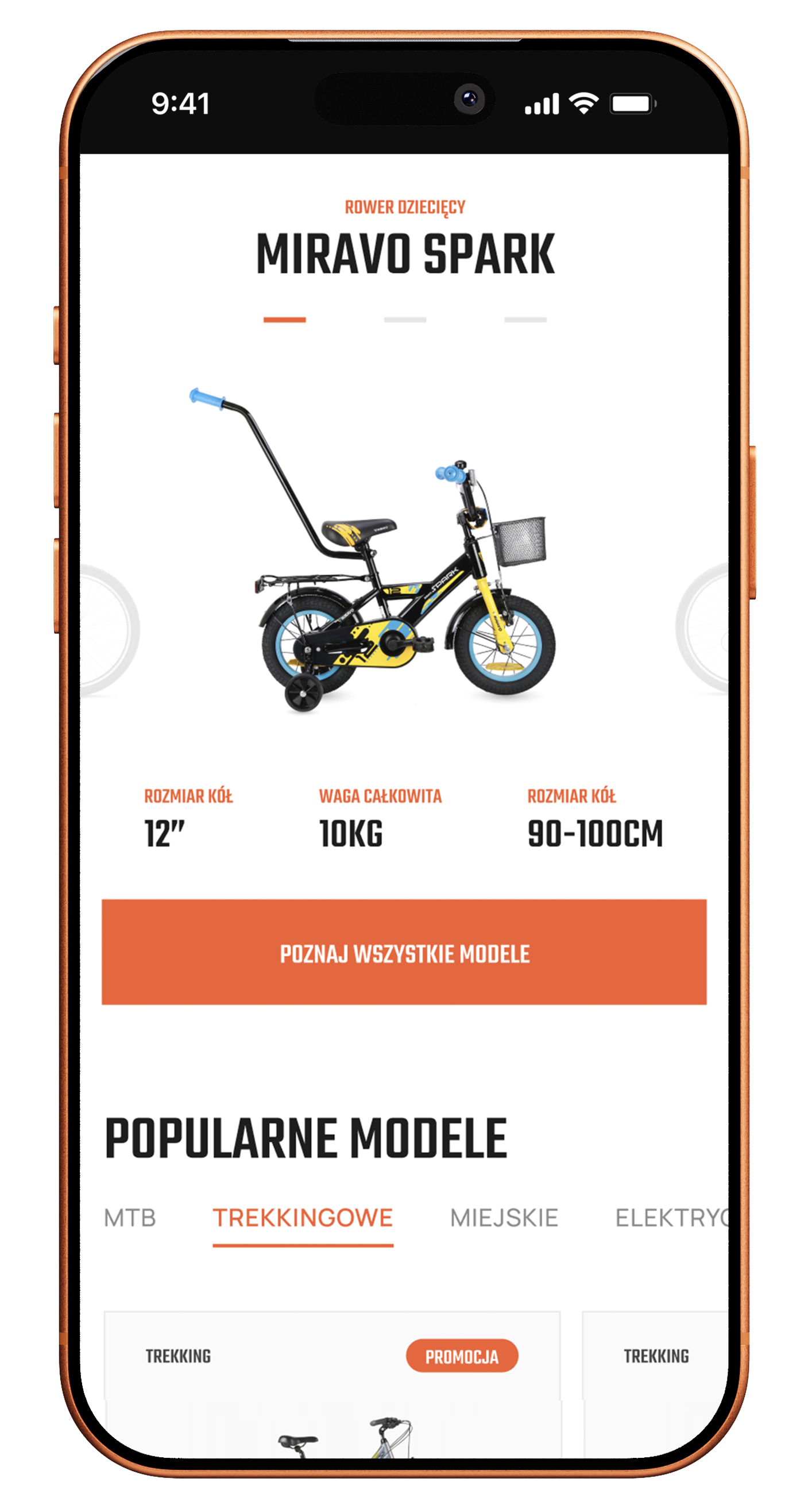
Mobile isn't a trend, it's where sales happen

1.
Faster understanding of the product
On a phone, users should immediately see who a given bike is for and how to pick the right model. That is why the mobile views were designed so the most important purchasing information is visible quickly and clearly.
2.
Mobile built around the purchase decision
The mobile layout was thought through so users can comfortably compare models, move between variants and get a better grasp of the specifications without a sense of chaos.
3.
Entering the offer straight from the homepage
In this project it also mattered that the homepage sections work well on a phone and help users get into the right type of bike faster, instead of leaving them alone with the whole catalogue too early.
Scope of our work
Dedicated solution
In this project we implemented custom solutions that make choosing a bike easier and present the offer better right on the homepage. One of them is an original way of presenting selected models with interactive points embedded directly on the bike, which expand to reveal extra information about its specific components.
The second solution was a mechanic for quickly filtering the offer by height and size fit straight from the homepage. As a result the store leads users to more relevant models earlier in the purchase path and supports conversion more effectively.

If you are looking for an agency that is not passive in cooperation and can take responsibility for strategy, SEO and Google Ads campaigns for several brands at once, I can wholeheartedly recommend Igor and Sky.
Together, we made it happen
Brands that chose sky









TIME FOR THE NEXT STEP
CONTACT US
Do you have a store, service, or brand you want to genuinely grow online?
Head over to our simple contact form and let us know what you need today.
We will get back to you with a concrete proposal for next steps and a time for a brief call.