
We'll call you back
Coroutines Mastery
Webflow
Shopify
Web Design
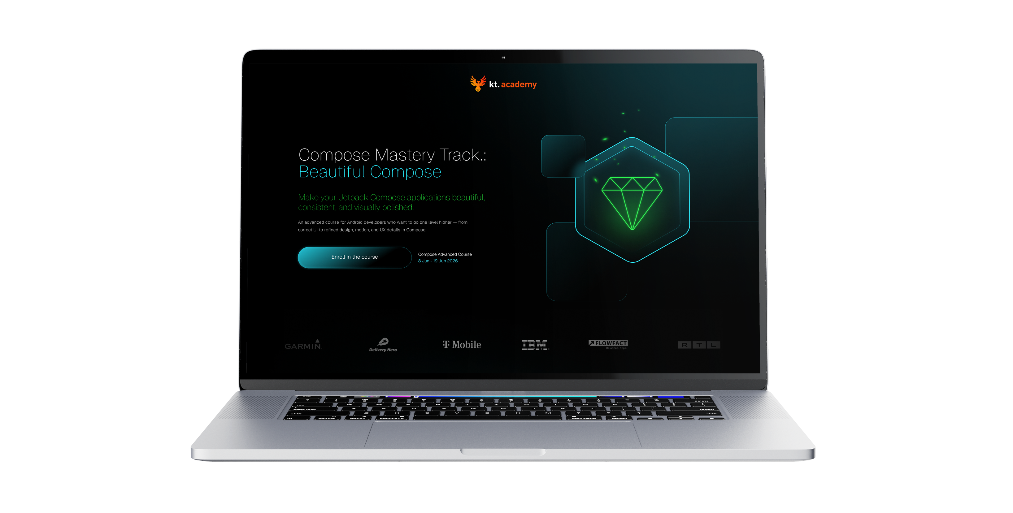
A course landing page for an educational brand in the Kotlin space, built to sell one specific training programme. The goal was to organise the course offer, better convey its scope, dates, format and substance, and design a page that supports the purchase decision and puts the most important information in order before sign-up.
No items found.
About the brand
Coroutines Mastery is a specialised educational product within the KT Academy ecosystem, focused on learning Kotlin Coroutines, Flow and concurrency patterns. In this project it was important to take an existing, expert brand and translate it into a landing page that sells one specific course in a more precise and organised way.
Our scope of work
What we do




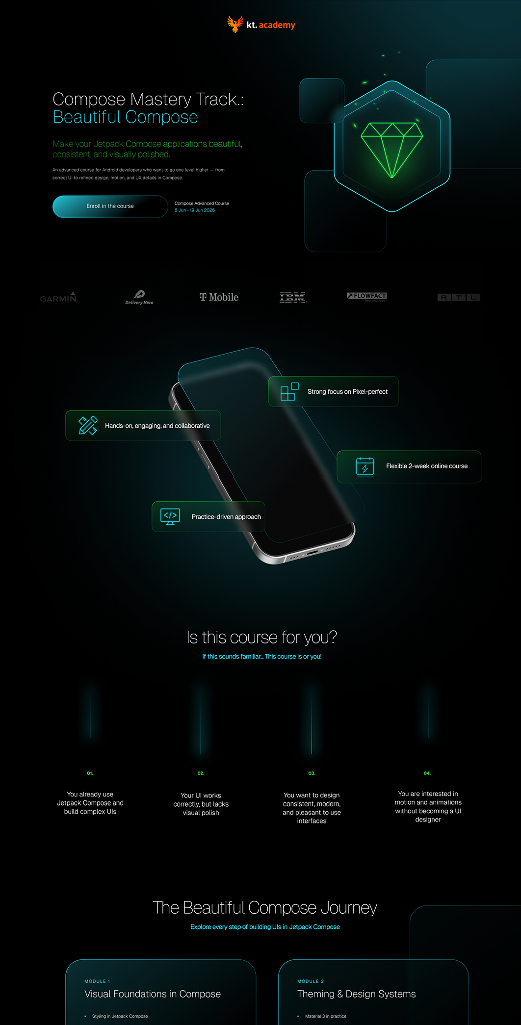
As part of the project we prepared the branding and visual layer of the landing page, based on the direction developed earlier for KT Academy but adapted to one specific educational product. The key was designing a page that does not distract users with the whole brand's broad offer, but focuses attention on a single course, its structure, dates, curriculum and benefits for a developer.
We put a lot of emphasis on the sales architecture of the content. The landing page was laid out to lead users through the problems the course solves, then through the scope of material, the learning format, the expert's profile, participant feedback and the final CTA. It was also important that the page works on trust and concrete pre-purchase arguments, such as course length, the weekly schedule, the community, the ebook, the certificate and real participant reviews. That is exactly the logic you see on the live page: a hero with a waitlist, a description of the problems, the weekly scope, a presentation of the instructor, feedback and elements like the ebook and certification.
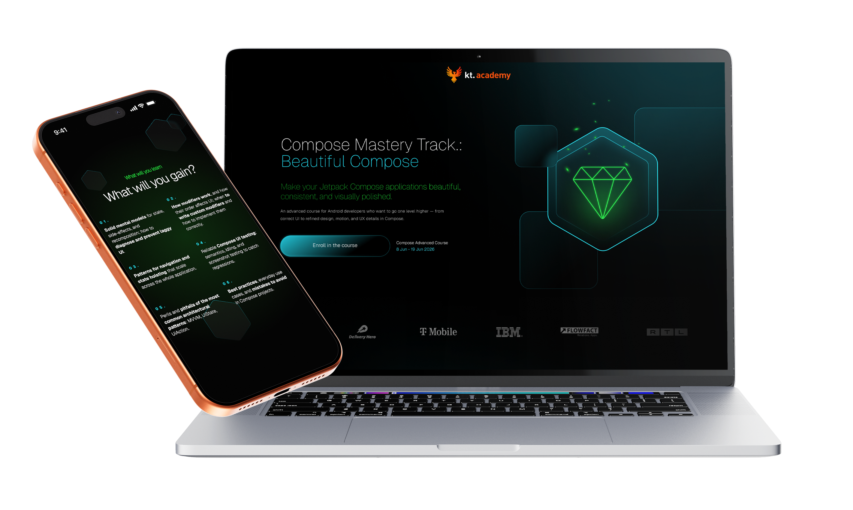
Your customer isn't sitting at a desk
Mobile isn't a trend, it's where sales happen

1.
A course you understand without long searching
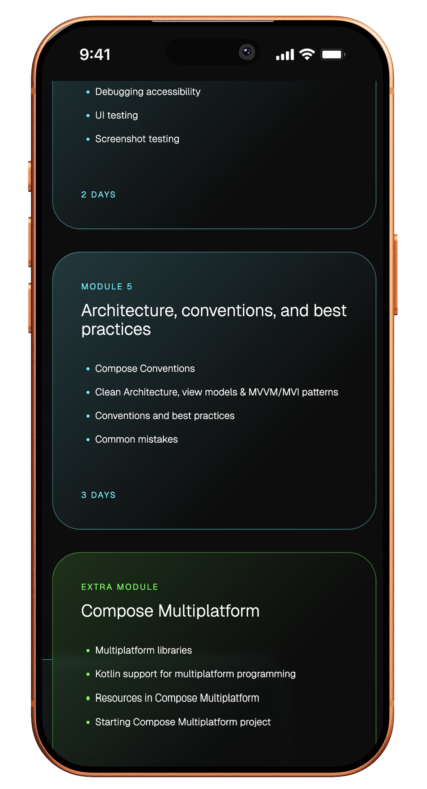
On a phone, users should immediately understand what the course covers, when it starts and who it was built for. That is why the mobile layout was designed so the most important information about the programme and format is visible early in the scroll.
2.
Content ordered for the moment of purchase
In this project it was not only aesthetics that mattered, but the order of the arguments. Mobile had to lead users through the problems, the scope of material, the instructor's authority and the feedback so that signing up feels like a natural outcome rather than another step requiring more research.
3.
A long landing page that does not tire you out
With an extensive course offer, it was important that the page should not feel heavy on a phone. The sections were arranged to keep rhythm, readability and a sense of progress despite the large amount of information needed before sign-up.
Scope of our work
Dedicated solution
The key in this project was designing a dedicated sales architecture for a single course rather than a whole educational platform. The landing page was built to combine the presentation of the programme, the schedule, the expert's authority, participant reviews and the sign-up path into one coherent flow that turns interest in the course into a purchase decision more effectively.

Since we started working with Igor and his team, the store we work on has genuinely grown and, above all, we understood that advertising can be done far better, smarter and more effectively. This is a partnership focused on growth and numbers, not empty promises.
Together, we made it happen
Brands that chose sky









TIME FOR THE NEXT STEP
CONTACT US
Do you have a store, service, or brand you want to genuinely grow online?
Head over to our simple contact form and let us know what you need today.
We will get back to you with a concrete proposal for next steps and a time for a brief call.