
We'll call you back
Autodirect
Website
Web Design
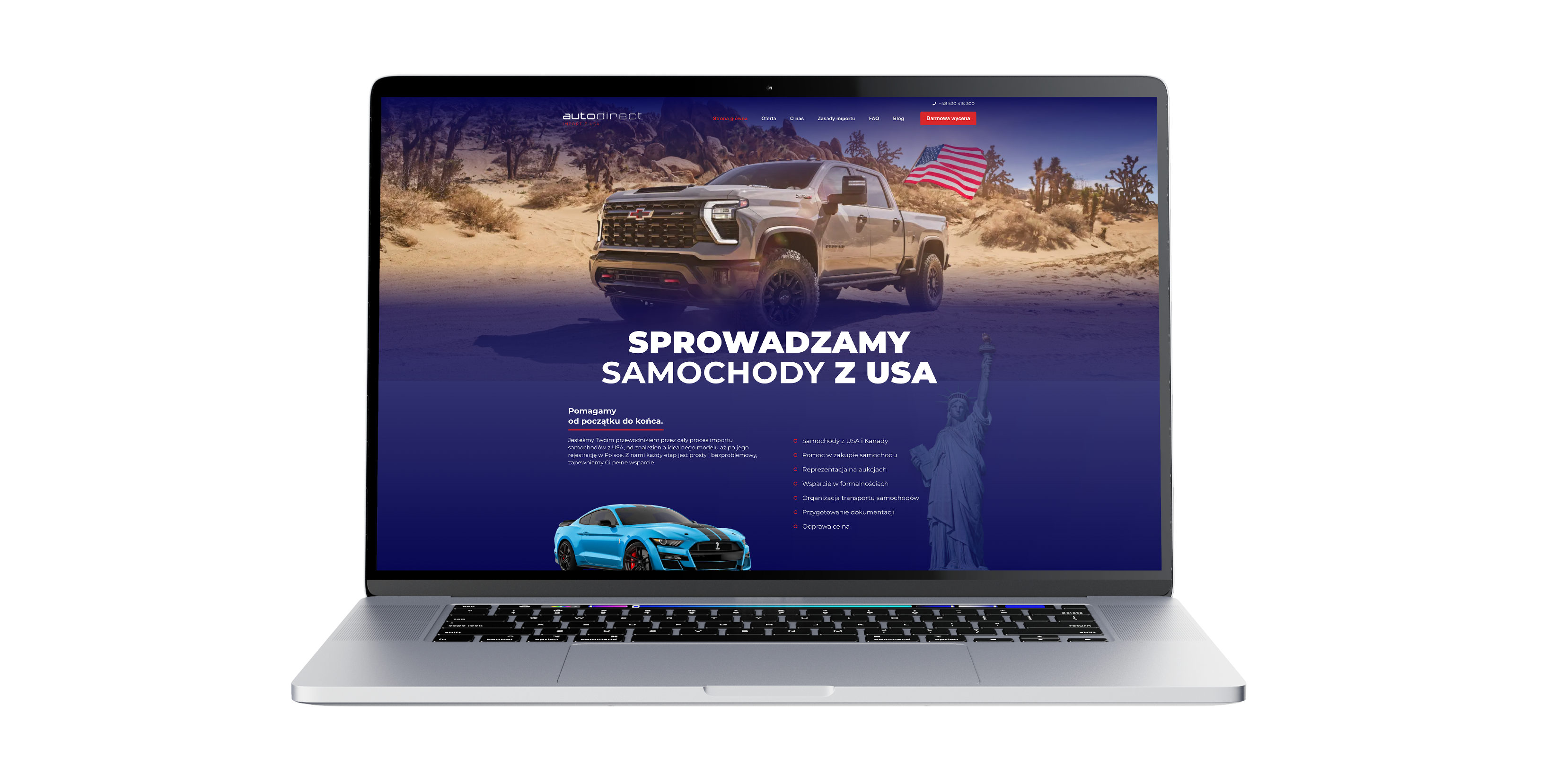
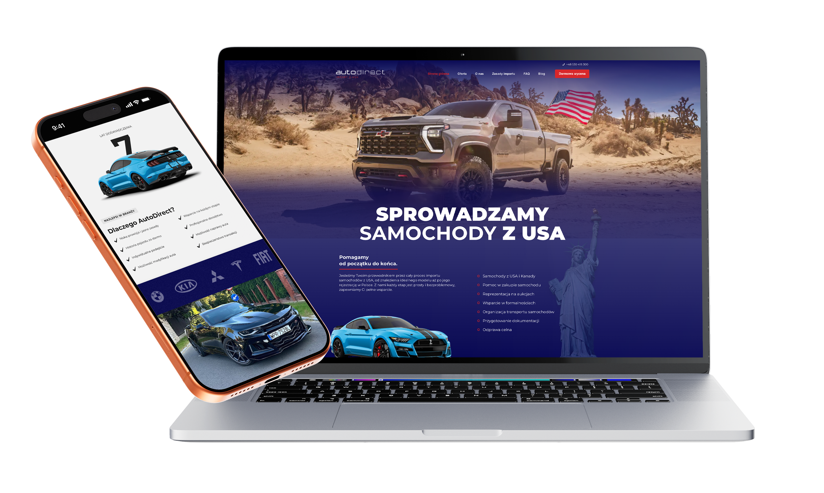
A new website for a brand importing cars from the USA and Canada, designed as a simple and clear lead generation site. The goal was to organise the offer, show the import process step by step and shorten the route to getting in touch and requesting a free quote.
No items found.
About the brand
AutoDirect is a brand importing cars from the USA and Canada, offering support from choosing a vehicle through to paperwork, transport and registration. In this project it was important to create a credible, easy-to-follow site that clearly explains the service and shortens the distance to first contact.
Our scope of work
What we do




As part of the project we built the entire website from scratch, designing it individually around the brand and its tone of voice. This was a simple showcase-and-lead site, without elaborate mechanics, so the key was not to add unnecessary layers but to arrange the content and sections so that users quickly understand what the company does, how the cooperation works and where to take the next step.
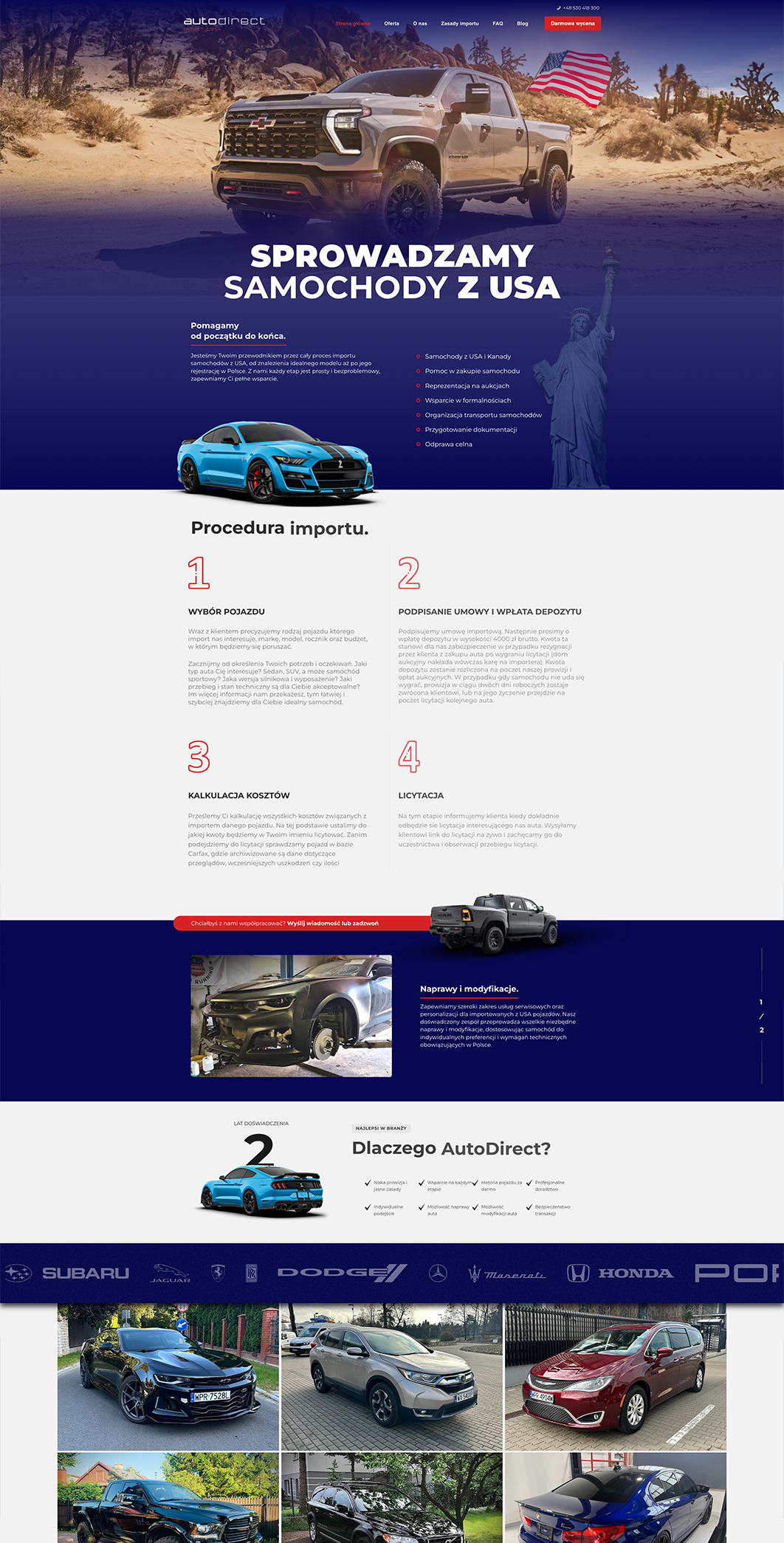
We put a lot of emphasis on presenting the import process in an organised, understandable form and on highlighting the contact form and the free quote. The site was meant to be the first touchpoint with the brand, build basic trust and turn interest in the service into a lead as quickly as possible. That structure is exactly what you see on the live site: a hero section with a free-quote CTA, the import procedure laid out in detail, an FAQ and additional information about vehicle repairs and modifications.
Your customer isn't sitting at a desk
Mobile isn't a trend, it's where sales happen

1.
A process to scan, not to study
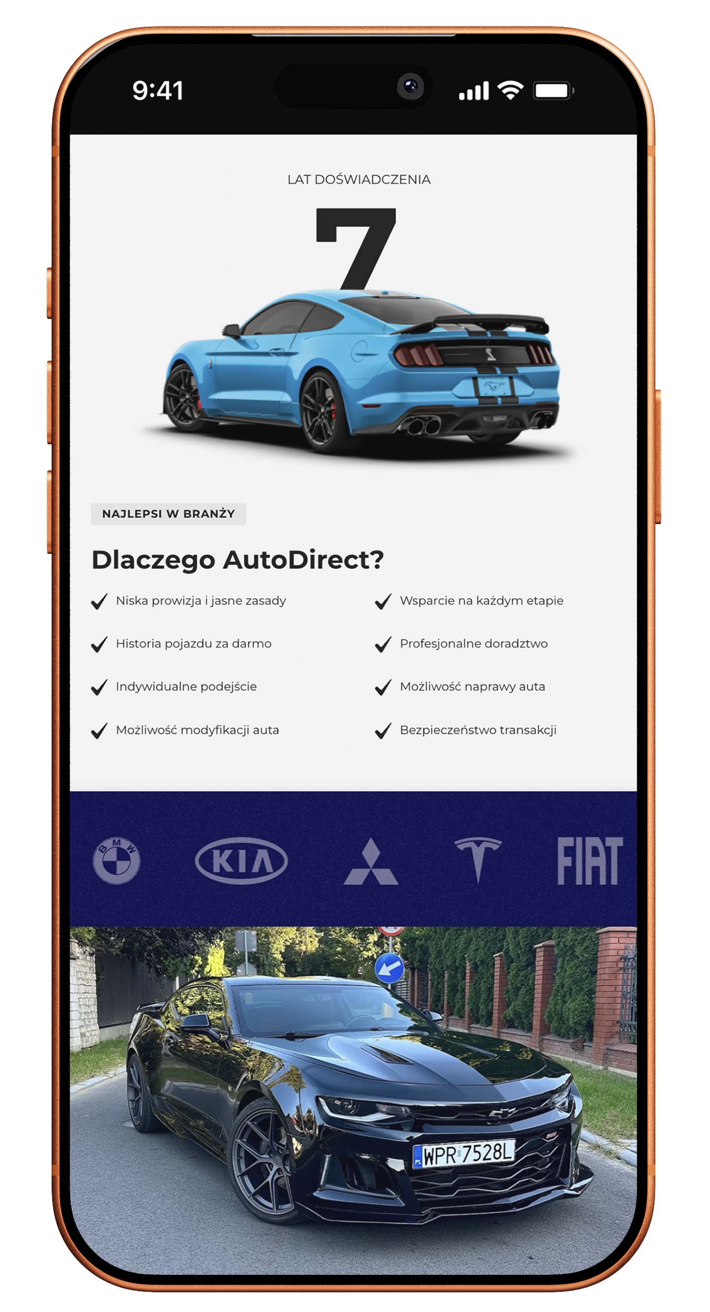
On mobile, users often want to judge within moments whether the company has the whole import process covered. That is why the layout was designed so the stages of cooperation are clear and easy to scan on the very first scroll.
2.
Contact visible before hesitation sets in
In this project the phone was meant to shorten the route to action. So it was important to place the form, phone number and CTA in a way that means users do not have to hunt for a way to get in touch after going through the whole page.
3.
A simple form without unnecessary weight
This was not a project built on flashy mechanics, but on clarity. Mobile was therefore laid out so the site feels light, readable and focused on what really matters: the offer, the procedure and the lead.
Scope of our work
Dedicated solution
The value in this project was not extensive functionality, but a deliberate simplification of the user path. The site was designed to combine the presentation of the import process, the core sales arguments and the free quote into one simple route to contact. This approach works well for a site focused primarily on lead generation.

If you are looking for an agency that is not passive in cooperation and can take responsibility for strategy, SEO and Google Ads campaigns for several brands at once, I can wholeheartedly recommend Igor and Sky.
Together, we made it happen
Brands that chose sky









TIME FOR THE NEXT STEP
CONTACT US
Do you have a store, service, or brand you want to genuinely grow online?
Head over to our simple contact form and let us know what you need today.
We will get back to you with a concrete proposal for next steps and a time for a brief call.