
We'll call you back
Animatria
Website
Web Design
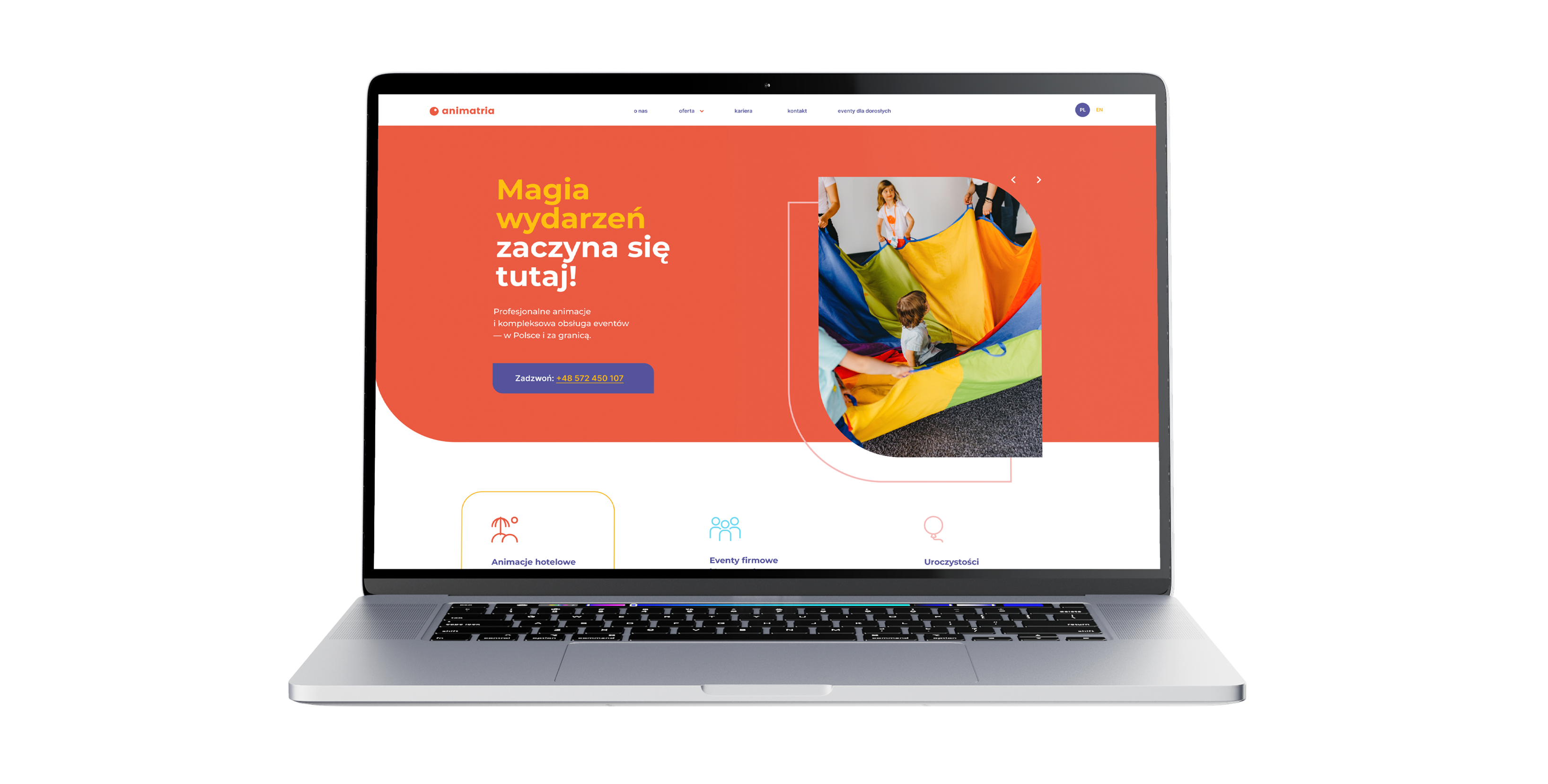
A project to build a website from scratch for an event brand working in children's entertainment and events, with an emphasis on a more premium perception, a better presentation of the offer and stronger social proof. The site was designed as a sales-and-image tool that reinforces the brand's credibility and supports generating enquiries from B2B clients.
No items found.
About the brand
Animatria is a brand specialising in children's entertainment and event support, operating in a B2B model but also serving several parallel segments such as corporate events, educational institutions, hotels, private events and equipment rental. In this project the key was organising that broad offer so the brand looks more professional, credible and premium, without departing from the client's existing brand. Publicly you can see several separate entry paths into the offer and communication aimed at different types of audience.
Our scope of work
What we do




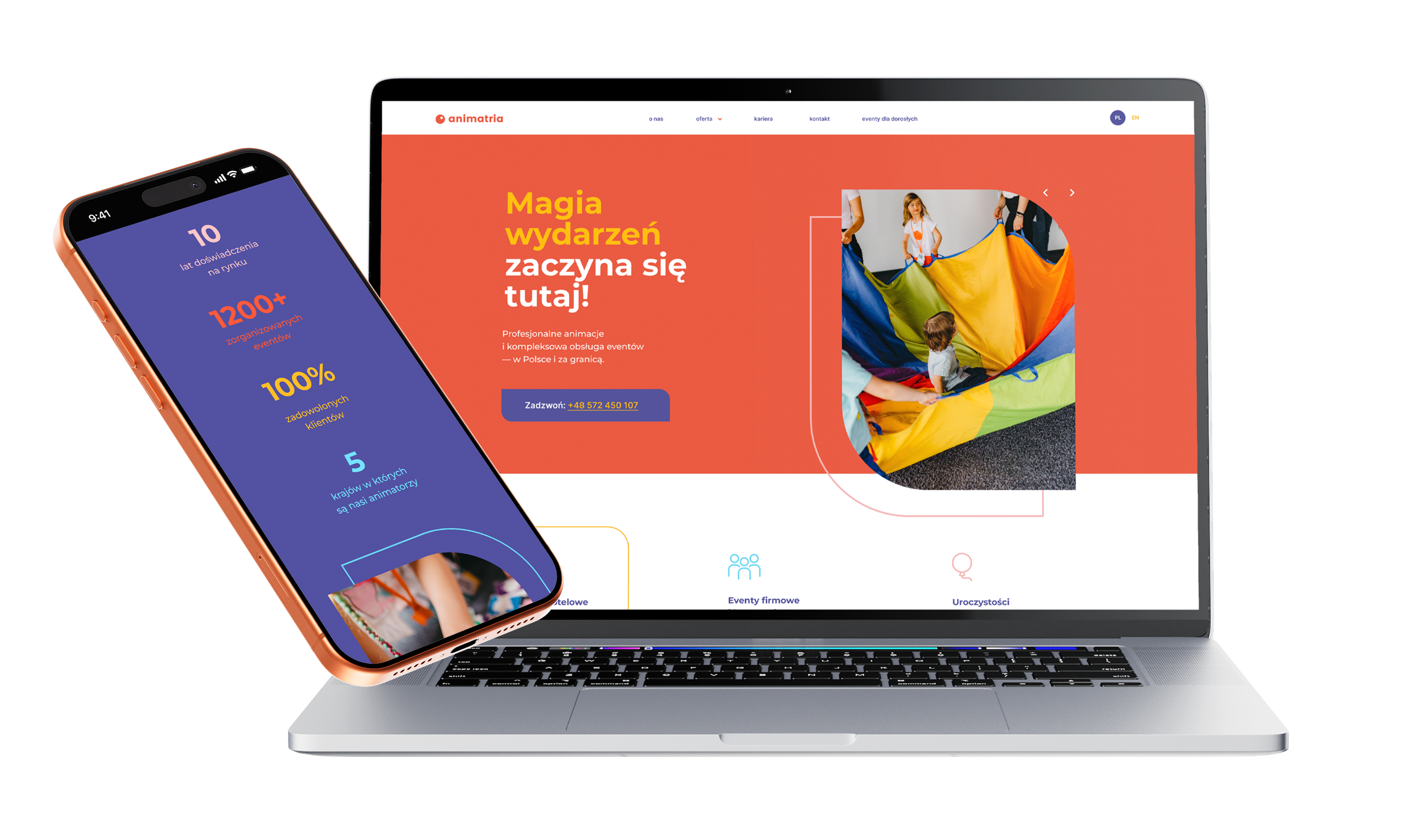
We delivered the project from scratch, working from the client's existing branding and lightly refreshing the brand's communication. On our side was designing and implementing the entire site, preparing the information architecture, organising the offer, expanding the mega menu and creating a page that communicates the service range better and leads users to contact. In parallel we implemented two language versions and planned the site structure with SEO in mind, including local entry points into the offer. On the live site you can see an extensive offer menu, PL and EN versions and local subpages in the footer.
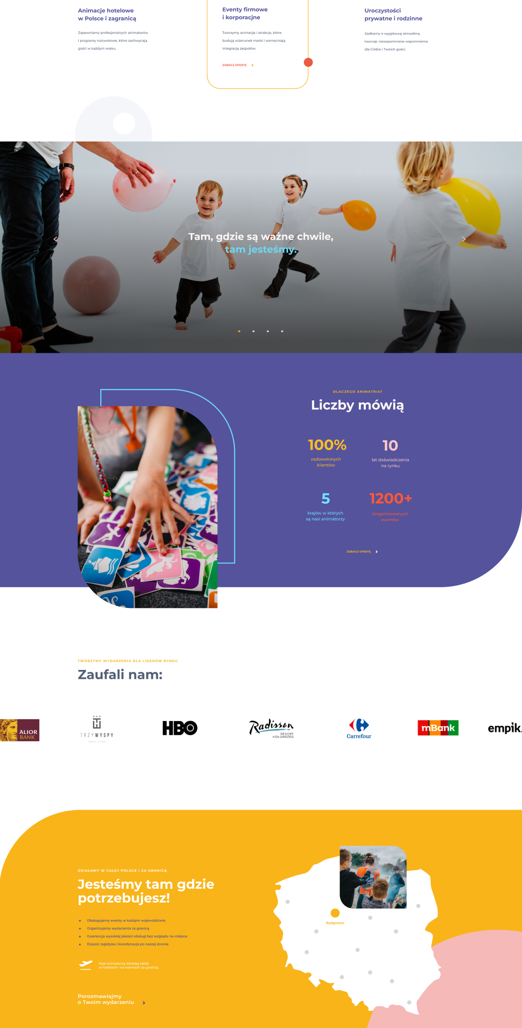
We put a lot of emphasis on building trust. The site was designed to show the scale of the business, the brand's experience, the cooperation process and its work with recognisable clients right on the homepage. As a result the site is not purely informational – it also works as a tool that reinforces credibility and supports the decision to get in touch. On the site you can see sections with numbers, brand logos, recommendations and a described cooperation process.
Your customer isn't sitting at a desk
Mobile isn't a trend, it's where sales happen

1.
An offer that is clear from the first scroll
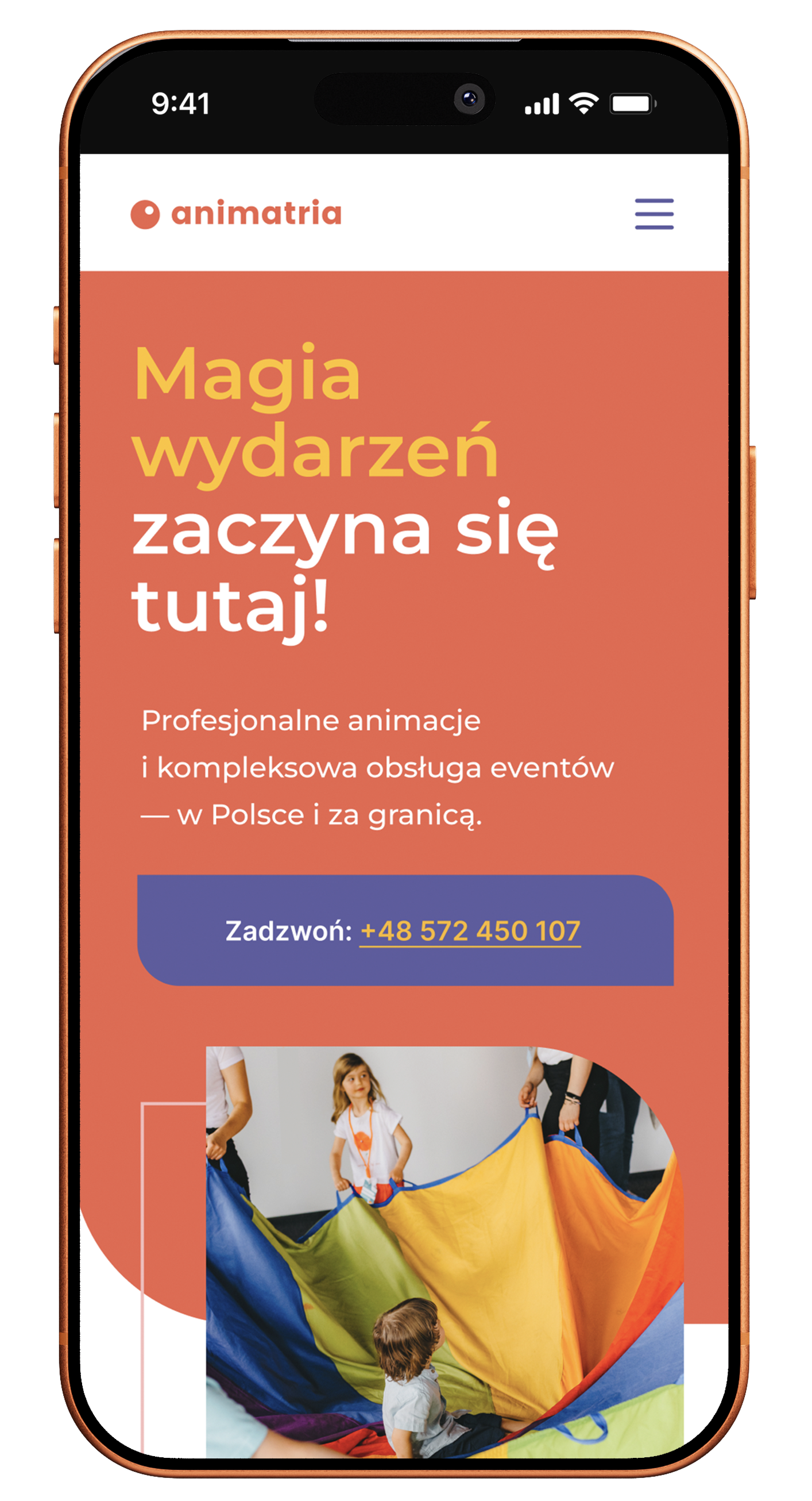
On a phone, users have to understand quickly whether they are in the right place and whether the brand handles exactly the type of event they are looking for. That is why the mobile views were designed so the offer is easy to scan and entering the right service segment does not require pushing through an overly heavy content layout.
2.
Social proof that works on a small screen too
In this project the phone was not just meant to display the page correctly, but to build the brand's credibility effectively. So the mobile layout was built around a clear presentation of numbers, recommendations, logos and quality arguments, so users quickly feel they have landed on a brand with experience and delivery capacity.
3.
Mobile that leads to contact without friction
With a broad offer it was important not only to show the services but to make the move to action smooth. The mobile views were laid out so users can go effortlessly from learning about the offer and the references to taking the next step and getting in touch. Publicly you can see a strong CTA to discuss an event and clearly laid out contact details.
Scope of our work
Dedicated solution
In this project we implemented a site architecture that organises the brand's broad offer and leads users to the right service through several different entry paths. An extensive mega menu, offer segmentation, local SEO entry points and two language versions form a coherent system that supports both usability and the site's visibility. The page also uses a section with a map and location points as an element that reinforces the brand's scale and its operational readiness to deliver events in different parts of Poland. Publicly you can see the multi-segment menu, the PL/EN versions and a section about covering events nationwide.

Since we started working with Igor and his team, the store we work on has genuinely grown and, above all, we understood that advertising can be done far better, smarter and more effectively. This is a partnership focused on growth and numbers, not empty promises.
Together, we made it happen
Brands that chose sky









TIME FOR THE NEXT STEP
CONTACT US
Do you have a store, service, or brand you want to genuinely grow online?
Head over to our simple contact form and let us know what you need today.
We will get back to you with a concrete proposal for next steps and a time for a brief call.